Every Picture Is a Compromise
Lessons from the Also-rans
Most photography websites show the photographer's very best work. Wonderful. But that's not the full story of a creative life. If we want to learn, we'd better pay attention to the images that aren't "greatest hits" and see what lessons they have to offer. Every picture is a compromise — the sum of its parts, optical, technical, visual, emotional, and even cosmic – well, maybe not cosmic, but sometimes spiritual. Success on all fronts is rare. It's ok to learn from those that are not our best.
This is a series about my also-rans, some of which I've been able to improve at bit (i.e., "best effort"), none of which I would consider my best. With each there are lessons worth sharing, so I will.
Previous image | Next image |
Original digital capture
Just a Touch of Warming
Color Balance
For (I'm sure) deeply psychological reasons, we humans generally prefer things that are warm. Soup, campfires, bed, beaches come to mind. Seems so with photographs, too. This week will include images improved with a bit of warming in processing.
What I saw that I liked:
Side of a shed in Lone Pine, California.
What I don't like in the picture:
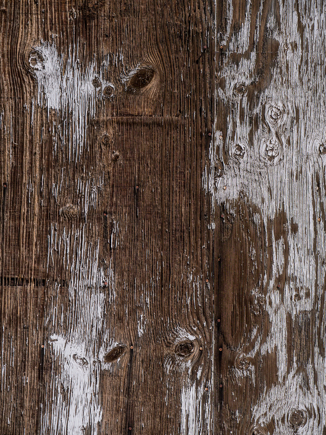
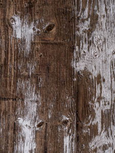
I knew there was a picture here, somewhere, but I struggled to find it. The fading paint was the first draw, but it was the dried grain in the boards where I thought the picture might be. The one above wasn't it.
What I learned:
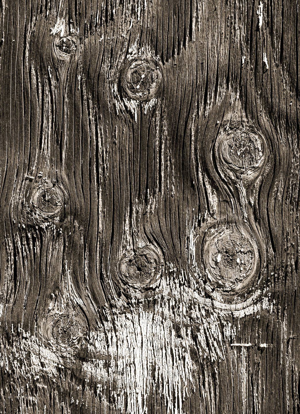
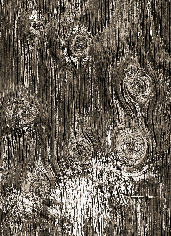
And then I saw the board at left with its seven eyes staring back at me. (Does this qualify me to wear a tinfoil hat?) In this case, the warm tone is not from a color balance adjustment. Instead, I converted to b/w and then warmed the image globally with Color Grading. A nice, universal warm tone in the entire image. |
|