Every Picture Is a Compromise
Lessons from the Also-rans
Most photography websites show the photographer's very best work. Wonderful. But that's not the full story of a creative life. If we want to learn, we'd better pay attention to the images that aren't "greatest hits" and see what lessons they have to offer. Every picture is a compromise — the sum of its parts, optical, technical, visual, emotional, and even cosmic – well, maybe not cosmic, but sometimes spiritual. Success on all fronts is rare. It's ok to learn from those that are not our best.
This is a series about my also-rans, some of which I've been able to improve at bit (i.e., "best effort"), none of which I would consider my best. With each there are lessons worth sharing, so I will.
Previous image | Next image |
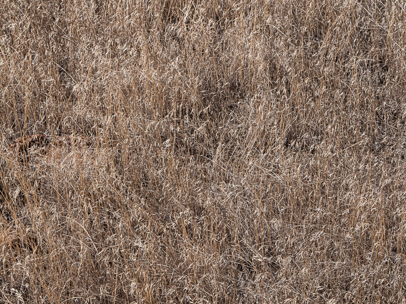
Original digital capture
Just a Touch of Warming
Color Balance
For (I'm sure) deeply psychological reasons, we humans generally prefer things that are warm. Soup, campfires, bed, beaches come to mind. Seems so with photographs, too. This week will include images improved with a bit of warming in processing.
What I saw that I liked:
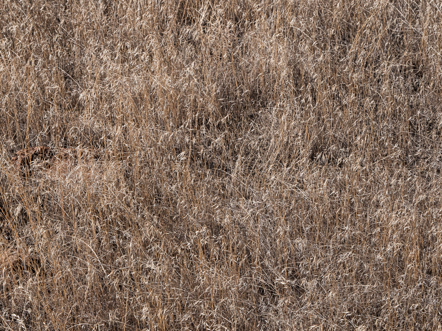
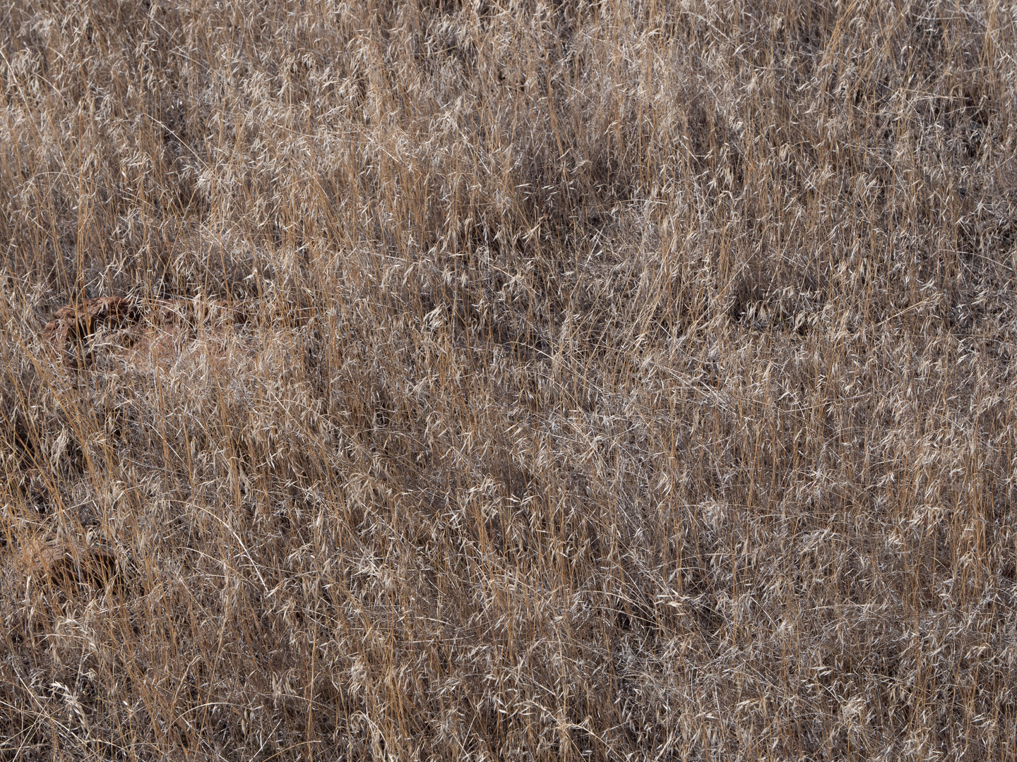
I can't resist dried grasses in the fall.
What I don't like in the picture:
The above is okay, but I knew I could enhance the "dryness" of the grasses with a small color balance shift.
What I learned:
The camera used an auto setting of 4900; I shifted the color balance visually to 5461 and the grasses (left) became even drier.
2nd Chances: What I might try next
Be careful about judging these subtle color balance shift on screen. When you go to print them, you might need to tweak the color balance even more to get the paper and ink to match the on-screen colors perfectly. |
|