Every Picture Is a Compromise
Lessons from the Also-rans
Most photography websites show the photographer's very best work. Wonderful. But that's not the full story of a creative life. If we want to learn, we'd better pay attention to the images that aren't "greatest hits" and see what lessons they have to offer. Every picture is a compromise — the sum of its parts, optical, technical, visual, emotional, and even cosmic – well, maybe not cosmic, but sometimes spiritual. Success on all fronts is rare. It's ok to learn from those that are not our best.
This is a series about my also-rans, some of which I've been able to improve at bit (i.e., "best effort"), none of which I would consider my best. With each there are lessons worth sharing, so I will.
Previous image | Next image |
Original digital capture
Fall Colors in B/W
Admittedly, few subjects in photography are more beloved than the annual forest extravaganza of fall colors. It may not be obvious, but that pertains to us b/w folks, too! This week will present five examples where beautiful colors also can make beautiful b/w renditions.
What I saw that I liked:
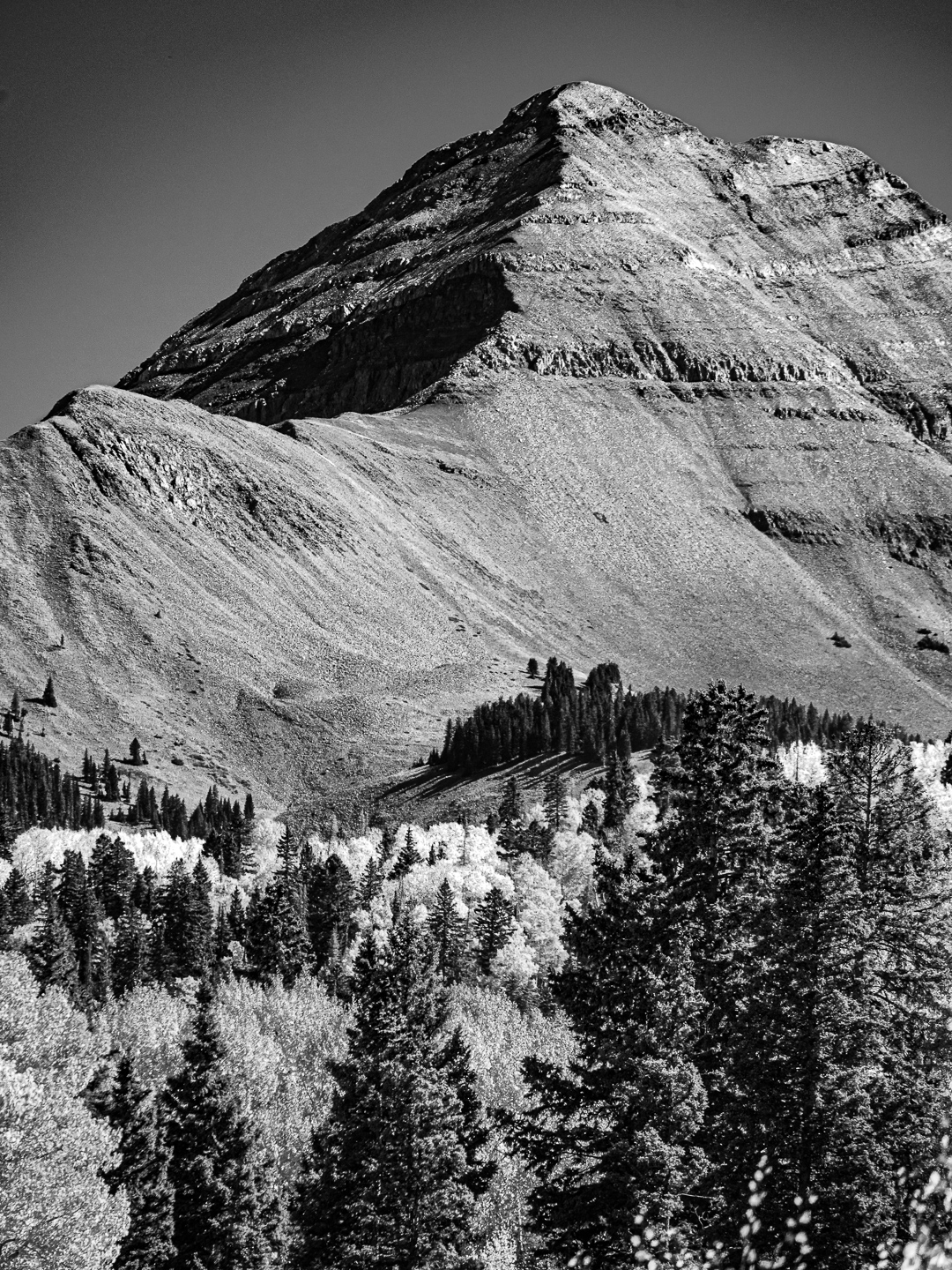
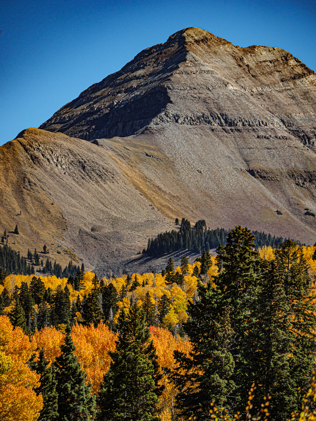
This peak rises from the forest with such authority and presence. I can almost imagine the trees down below in a forest supplication.
What I see in the color picture:
In spite of the positional strength of the mountain and the vibrance of the blue sky, my eye is drawn forcefully to the colors in the lower left corner. This diminishes the power of the mounting.
What I see in the b/w version:
For reasons I can't explain, the b/w version seems to individualize the trees. They become less of a forest and more a collection of individual trees. And then there is that looming mountain that almost seems to be Olympian and I wouldn't be surprised to see some Greek god lives up there. It's interesting to me how the change in rendition creates an entirely different feeling about the mountain peak. |
|