Every Picture Is a Compromise
Lessons from the Also-rans
Most photography websites show the photographer's very best work. Wonderful. But that's not the full story of a creative life. If we want to learn, we'd better pay attention to the images that aren't "greatest hits" and see what lessons they have to offer. Every picture is a compromise — the sum of its parts, optical, technical, visual, emotional, and even cosmic – well, maybe not cosmic, but sometimes spiritual. Success on all fronts is rare. It's ok to learn from those that are not our best.
This is a series about my also-rans, some of which I've been able to improve at bit (i.e., "best effort"), none of which I would consider my best. With each there are lessons worth sharing, so I will.
Previous image | Next image |
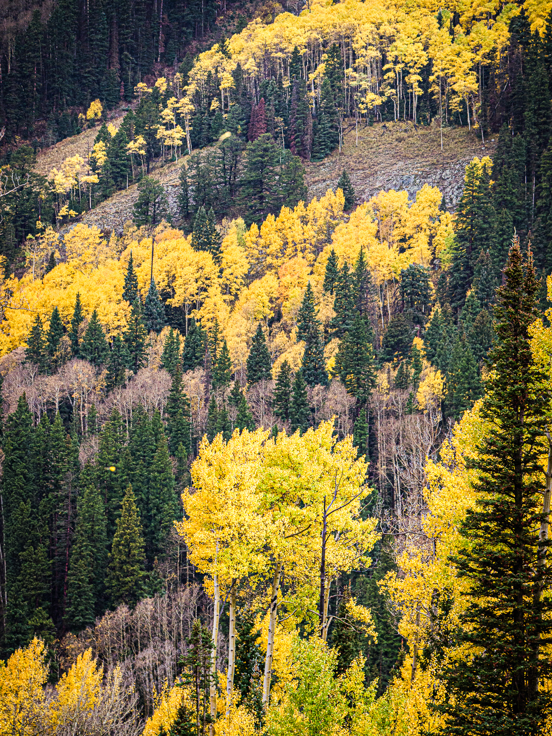
Original digital capture
Composing in Threes
There is a convention in graphic design to always use odd numbers in compositions. This week will be a look at landscapes that are composed using three elements compared to their counterparts using just two.
What I saw that I liked:
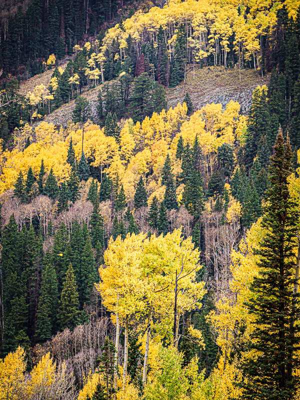
Lovely fall colors in the San Juan mountains of Colorado.
What I don't like in the picture:
The one above is a slightly zoomed in version of the one at left. I zoomed in to get closer to that round cluster of leaves in the bottom center.
What I learned:
Knowing I had a simple re-composition that would bring in the "threes" idea here, I simply zoomed out a bit to include the line of trees at the top of the frame. Here again, the image at left seems more "natural" to my eye than the even-numbered composition of two main elements in the above.
2nd Chances: What I might try next
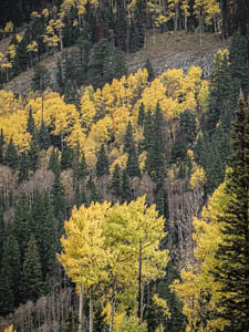
Did I over-sharpen this one? I need to double check that. |
|