Every Picture Is a Compromise
Lessons from the Also-rans
Most photography websites show the photographer's very best work. Wonderful. But that's not the full story of a creative life. If we want to learn, we'd better pay attention to the images that aren't "greatest hits" and see what lessons they have to offer. Every picture is a compromise — the sum of its parts, optical, technical, visual, emotional, and even cosmic – well, maybe not cosmic, but sometimes spiritual. Success on all fronts is rare. It's ok to learn from those that are not our best.
This is a series about my also-rans, some of which I've been able to improve at bit (i.e., "best effort"), none of which I would consider my best. With each there are lessons worth sharing, so I will.
Previous image | Next image |
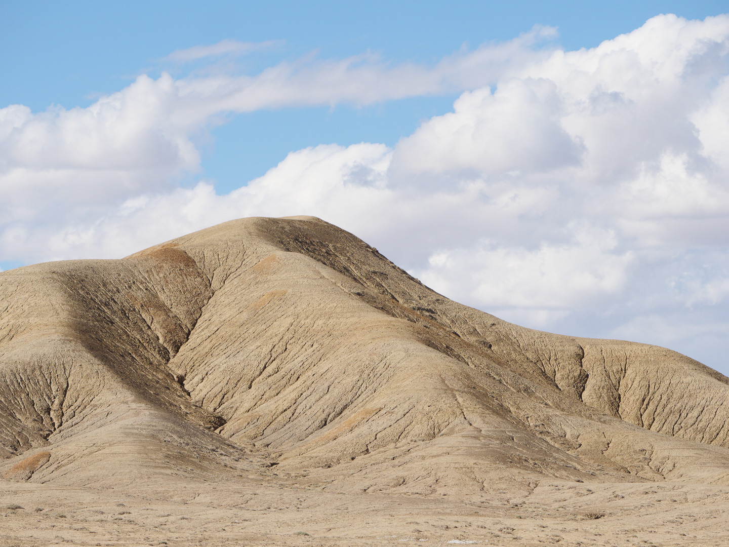
Original digital capture
Composing in Threes
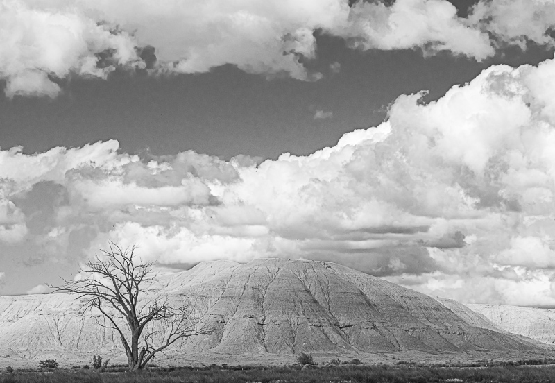
There is a convention in graphic design to always use odd numbers in compositions. This week will be a look at landscapes that are composed using three elements compared to their counterparts using just two.
What I saw that I liked:
These eroded hills in the Southwest are always photographable.
What I don't like in the picture:
Above is an example of a two-element composition — the hill and the cloudy sky. It's okay, but static.
What I learned:
"Composing in threes" often means introducing that third element in the composition that adds movement, surprise, context, or counterpoint to the main objects. In this example at left, that third element is the stark tree. Wouldn't you agree that the image at left is far more dynamic and interesting than the static example above?
2nd Chances: What I might try next
I need to work on the clouds a bit more on this one. I think I applied too much Clarity and the clouds look fake to my eye. Not good. |
|