Every Picture Is a Compromise
Lessons from the Also-rans
Most photography websites show the photographer's very best work. Wonderful. But that's not the full story of a creative life. If we want to learn, we'd better pay attention to the images that aren't "greatest hits" and see what lessons they have to offer. Every picture is a compromise — the sum of its parts, optical, technical, visual, emotional, and even cosmic – well, maybe not cosmic, but sometimes spiritual. Success on all fronts is rare. It's ok to learn from those that are not our best.
This is a series about my also-rans, some of which I've been able to improve at bit (i.e., "best effort"), none of which I would consider my best. With each there are lessons worth sharing, so I will.
Previous image | Next image |
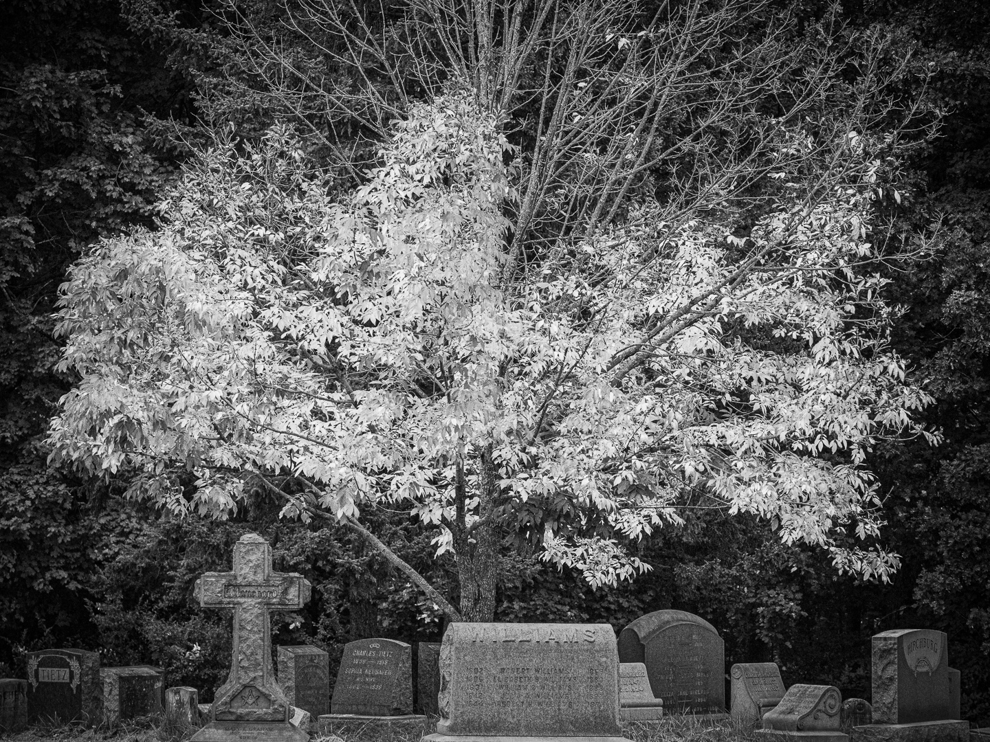
Original digital capture
Color Can Be a Distraction Week
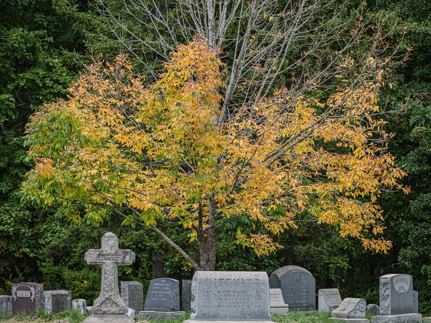
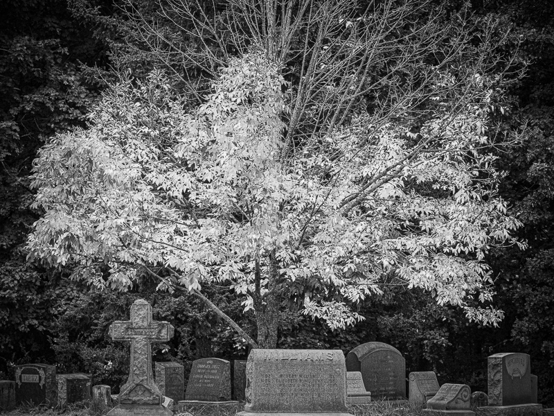
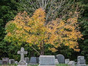
Sometimes the color of the subject is the reason we pick up the camera. We should be aware, however, that sometimes color can pull our attention in ways we don't want it to. Converting to b/w as the potential to pull our attention back to the true subject of the image.
What I saw that I liked:
What is this picture about? Broadly speaking, to me it is about spiritual ascension.
What I don't like in the picture:
I like the light color in the leaves that look like they are suspended above the grave markers, and I like the bare branches above the leaves that create a temporal sense to the leaves. I don't like the yellow that places this image in the fall season when all the leaves turn color.
What I learned:
By converting this color image to b/w, I remove any reference to the fall season. This strengthens to metaphor (IMHO) of the leaves as hovering above the grave markers in a moment of transition. Season of the year has nothing to do with that, so converting to b/w eliminates that as a distraction. |
|