Every Picture Is a Compromise
Lessons from the Also-rans
Most photography websites show the photographer's very best work. Wonderful. But that's not the full story of a creative life. If we want to learn, we'd better pay attention to the images that aren't "greatest hits" and see what lessons they have to offer. Every picture is a compromise — the sum of its parts, optical, technical, visual, emotional, and even cosmic – well, maybe not cosmic, but sometimes spiritual. Success on all fronts is rare. It's ok to learn from those that are not our best.
This is a series about my also-rans, some of which I've been able to improve at bit (i.e., "best effort"), none of which I would consider my best. With each there are lessons worth sharing, so I will.

Previous image | Next image |
Original digital capture

Variations Week
Whenever I'm out photographing and just "gathering assets," I never know or can predict how I will eventually use an image in a project. Will I need a vertical or a horizontal composition? Because I don't know, I find it useful to capture both. The same for close vs far, wide angle vs telephoto, shallow vs deep depth of field. This week, I'll post examples of this strategy that emphasizes flexibility.
What I saw that I liked:
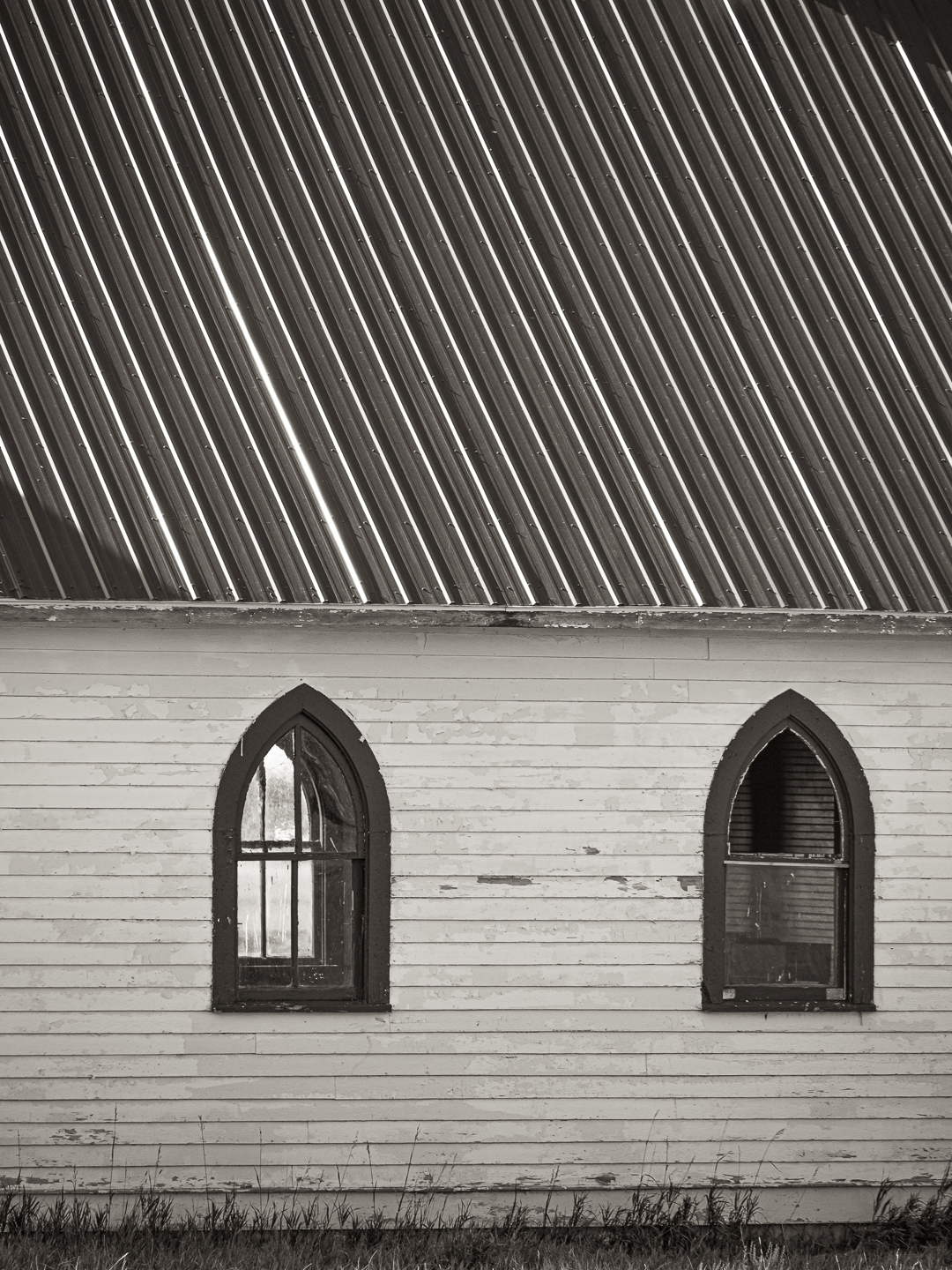
This old church by the side of the highway in Montana was a beauty.
An example of note:
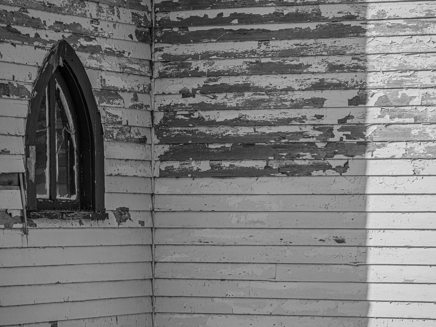
The image above was the first one that I saw from the highway. Click! But as I drove around to the back, the two windows and the double cross in the left one caught my eye. The modern tin roof was a disappointment when I first saw it, but then I realized the parallel lines created a pattern that was pretty complementary to the horizontal boards on the side of the wall. Here again, I have a horizontal option above and a strong vertical composition at left. |
|