Every Picture Is a Compromise
Lessons from the Also-rans
Most photography websites show the photographer's very best work. Wonderful. But that's not the full story of a creative life. If we want to learn, we'd better pay attention to the images that aren't "greatest hits" and see what lessons they have to offer. Every picture is a compromise — the sum of its parts, optical, technical, visual, emotional, and even cosmic – well, maybe not cosmic, but sometimes spiritual. Success on all fronts is rare. It's ok to learn from those that are not our best.
This is a series about my also-rans, some of which I've been able to improve at bit (i.e., "best effort"), none of which I would consider my best. With each there are lessons worth sharing, so I will.
Previous image | Next image |
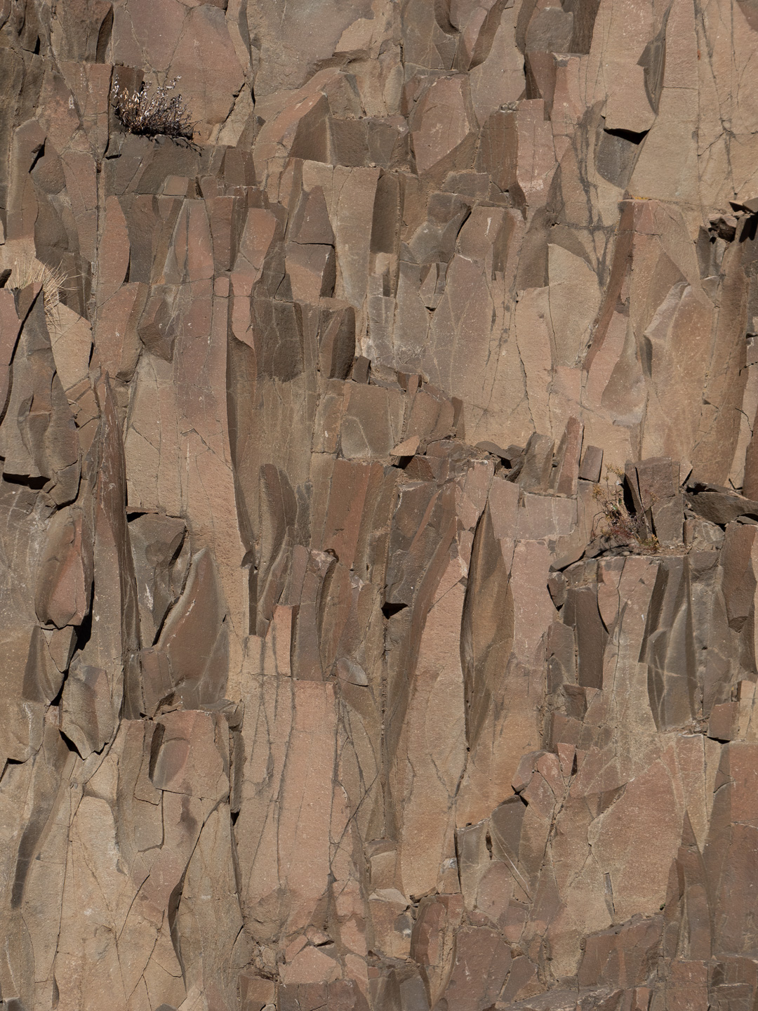
Original digital capture
Rock Wall Week
I have lots of captures of rock walls. Why? Don't know, but I do know I want to put together a small project with them. How does one make a rock wall visually interesting? An even greater challenge is how to make a group of them interesting without becoming repetitious. This week will feature five attempts to do just that.
What I saw that I liked:
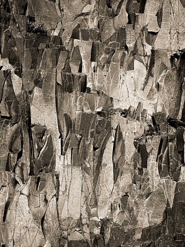
There's a bit of Picasso in this rock wall.
What I don't like in the picture:
Yup, another rock wall that is kind of dull and needs some help to bring its patterns to life.
What I learned:
There's increased contrast in processing and then there is even more increase in contrast. The more one pushes contrast up, the closer one dances on the edge of disaster. Just one additional unit of contrast and this one turns to yuck. I often find it useful to take a break when editing this type of image. Resting my eyes will bring back some sensitivity to the smallest processing changes. This is a good example of process by feel rather than processing by the numbers.
2nd Chances: What I might try next
Still trying to decide if this one needs to be warm-toned. |
|