Every Picture Is a Compromise
Lessons from the Also-rans
Most photography websites show the photographer's very best work. Wonderful. But that's not the full story of a creative life. If we want to learn, we'd better pay attention to the images that aren't "greatest hits" and see what lessons they have to offer. Every picture is a compromise — the sum of its parts, optical, technical, visual, emotional, and even cosmic – well, maybe not cosmic, but sometimes spiritual. Success on all fronts is rare. It's ok to learn from those that are not our best.
This is a series about my also-rans, some of which I've been able to improve at bit (i.e., "best effort"), none of which I would consider my best. With each there are lessons worth sharing, so I will.
|
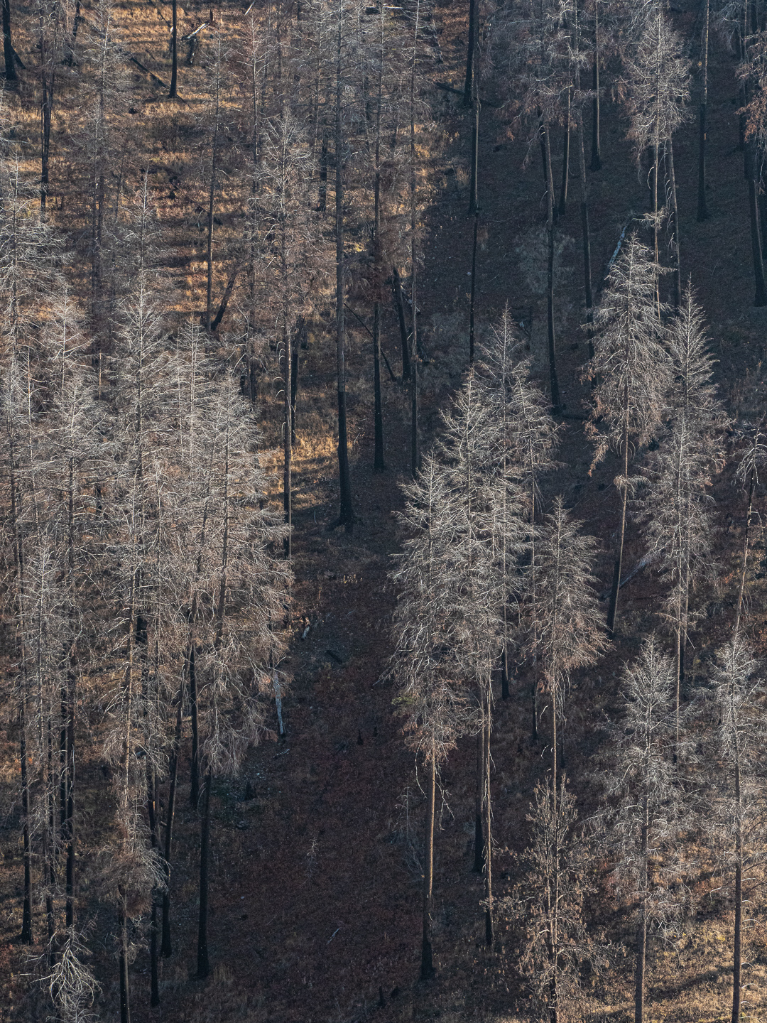
Original digital capture
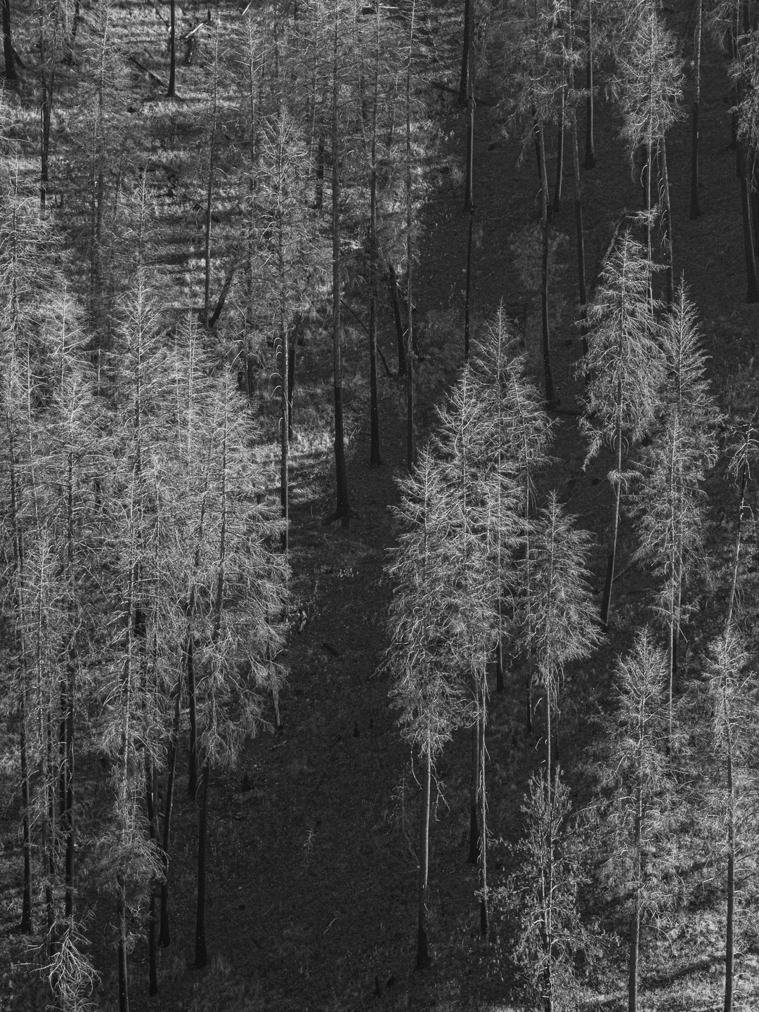
Color or B/W? WeekOne of the fundamental decisions in process our image is the question whether or not each image should be color or b/w. This week will be an exploration of that fundamental decision. What I saw that I liked:The remnants of this forest fire creates such a gossamer, almost ghost-like crowd of trees. What I don't like in the picture:This is what I would characterize as an extremely high-frequency image. Lots and lots and lots of tiny details. The b/w version above is just too frenetic because even the background of the hillside is filled with tiny details. What I learned:The color version at left had the same amount of details, but the slight orange color on the soil help differentiate the hillside from the burnt tree branches. That tamps down the frenetic feeling of this image and makes the burnt trees have visual dominance. |