Every Picture Is a Compromise
Lessons from the Also-rans
Most photography websites show the photographer's very best work. Wonderful. But that's not the full story of a creative life. If we want to learn, we'd better pay attention to the images that aren't "greatest hits" and see what lessons they have to offer. Every picture is a compromise — the sum of its parts, optical, technical, visual, emotional, and even cosmic – well, maybe not cosmic, but sometimes spiritual. Success on all fronts is rare. It's ok to learn from those that are not our best.
This is a series about my also-rans, some of which I've been able to improve at bit (i.e., "best effort"), none of which I would consider my best. With each there are lessons worth sharing, so I will.
|
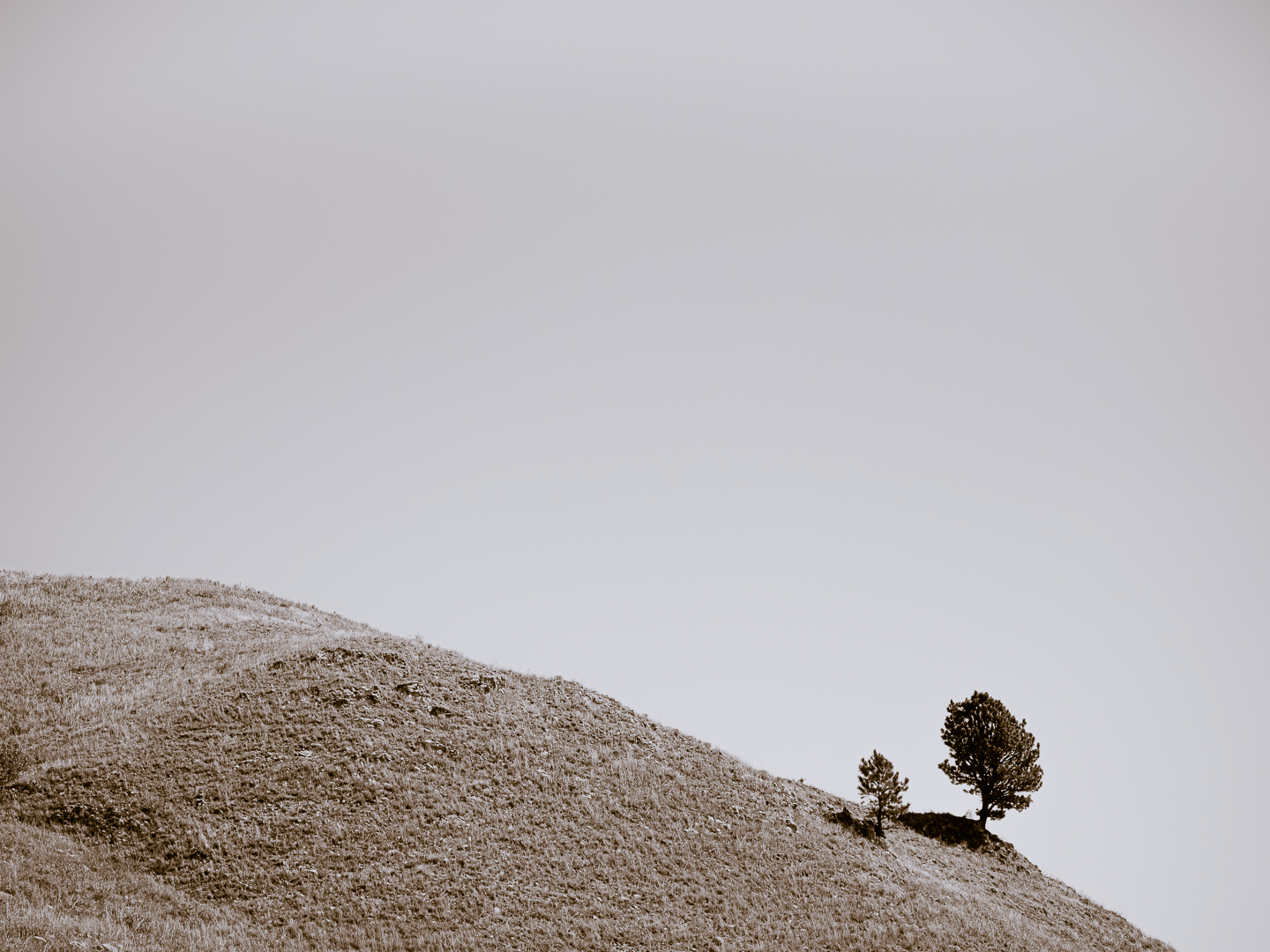
Original digital capture
Something from Nothing WeekNot infrequently, I'll look at an image in my Lightroom catalog and think, "What possible image did I think I saw in this mess?" This week, we'll look at examples that demonstrate why we should push ourselves to see what might be there, how we might create something from nothing. Trust the "you" that clicked the shutter. You never know when something interesting might be lurking in those pixels that seem to be hopeless. What I saw that I liked:I cannot resist these kinds of minimalist compositions. What I don't like in the picture:The color rendition above has a nice composition, but it's sort of lazy. It doesn't leap of the page and demand attention. When this happens, I always think it has something to do with the reality of the rendition. What you see in the above is pretty much what you would have seen had you been standing next to me as I clicked the shutter. What I learned:The rendition at left is a split-toned image. Technically it's a b/w image, but the highlights have been subtly tinted blue and the hillside and tree have been tinted brown. This unusual rendition makes me want to look more closely and to ask questions. Any time we can get a viewer to pause and think about what they are seeing, we can be glad that we engaged the view, even if it is for a short time. 2nd Chances: What I might try nextFor the dark tones, I used a reddish brown. I might want to try this with a yellowish brown instead. |