Every Picture Is a Compromise
Lessons from the Also-rans
Most photography websites show the photographer's very best work. Wonderful. But that's not the full story of a creative life. If we want to learn, we'd better pay attention to the images that aren't "greatest hits" and see what lessons they have to offer. Every picture is a compromise — the sum of its parts, optical, technical, visual, emotional, and even cosmic – well, maybe not cosmic, but sometimes spiritual. Success on all fronts is rare. It's ok to learn from those that are not our best.
This is a series about my also-rans, some of which I've been able to improve at bit (i.e., "best effort"), none of which I would consider my best. With each there are lessons worth sharing, so I will.
|
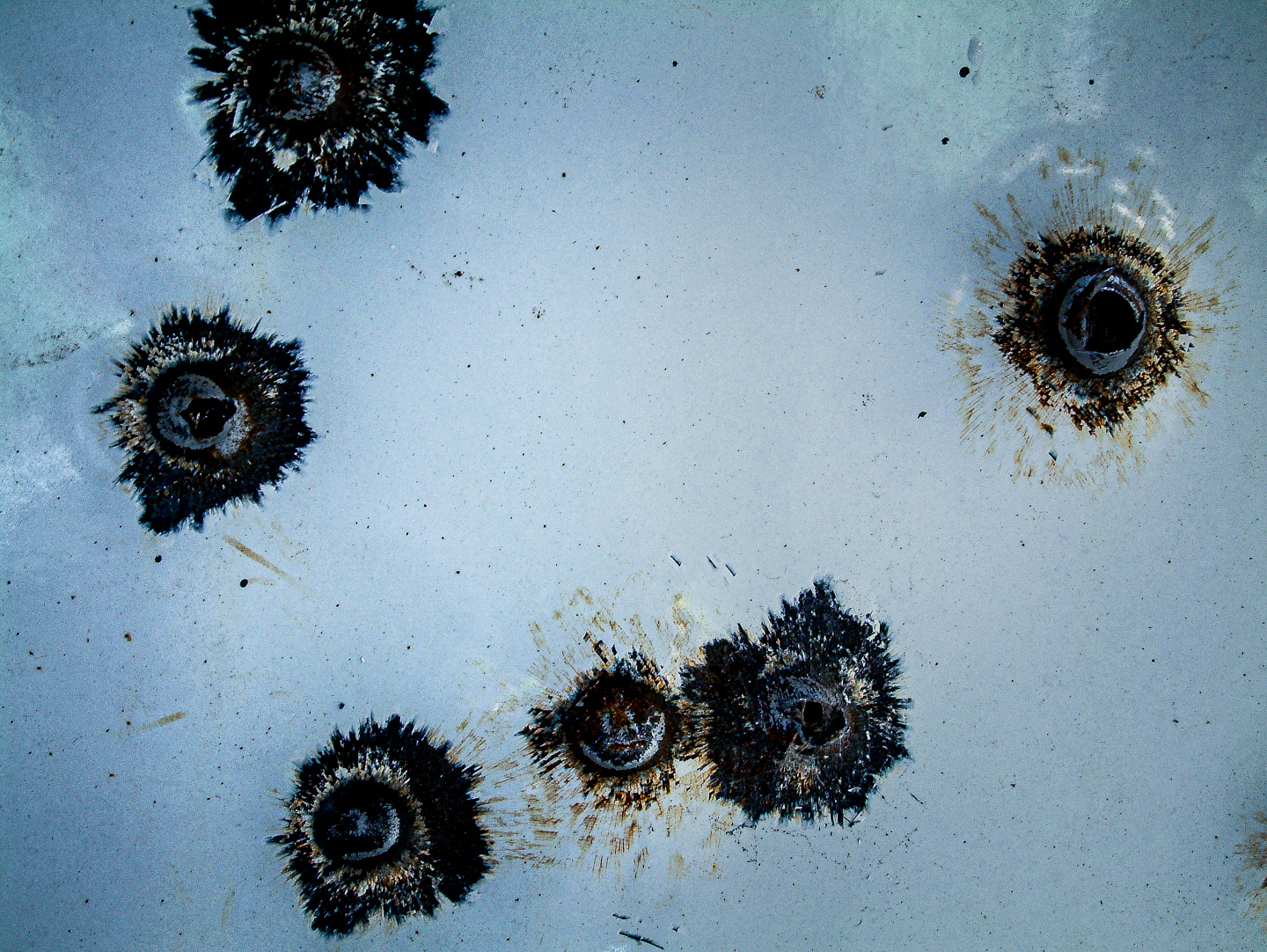
Original digital capture
What I saw that I liked:A pattern that caught my attention. What I don't like in the picture:All of us (some of us?) react strongly to colors. As a trained b/w photographer, my response to color is inconsistent and often irrational. The above is an example. I detest that yellow/green color so much that I ignored this image for almost 20 years (photographed in 2006). What I learned:Here in 2025, now with the easy color manipulation tools at our disposal, I decided to see if I could remove the color in the above that I found so objectionable. Shifting it to an ice clue — along with an increase in contrast — resulted in the image at left. I like this one a great deal. I have no idea what I would ever do with this violent image, but at least I don't mind looking at it now that I've eliminated the objectively accurate pukey colors of the original capture. 2nd Chances: What I might try nextI have a PDF project this image would fit into nicely that's a chapter in my Kokoro series titled Wall of Tears. That project is b/w. Could this color image fit there causing an emotion charge? |