Every Picture Is a Compromise
Lessons from the Also-rans
Most photography websites show the photographer's very best work. Wonderful. But that's not the full story of a creative life. If we want to learn, we'd better pay attention to the images that aren't "greatest hits" and see what lessons they have to offer. Every picture is a compromise — the sum of its parts, optical, technical, visual, emotional, and even cosmic – well, maybe not cosmic, but sometimes spiritual. Success on all fronts is rare. It's ok to learn from those that are not our best.
This is a series about my also-rans, some of which I've been able to improve at bit (i.e., "best effort"), none of which I would consider my best. With each there are lessons worth sharing, so I will.
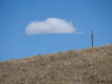
Original digital captureWhat I saw that I liked:Clearly, I was working a compositional idea with these two. What I don't like in the picture:Too much of a good thing creates a formulaic and boring image. Like the one above. The cloud is too centered and the foreground of the hillside is too prominent. What I learned:Balance is not a symmetric thing; it is a balance thing. The image at left is balanced to my eye. The one above should be with that cloud in the middle, but the pole pulls the eye too far to the right. The cloud and the tree in the above have equal visual weight and the overall composition is more balanced. I think this is an idea that needs to be intuitively developed, not measured with a ruler. Balance is a tricky thing, but when you achieve it, it become tangible. 2nd Chances: What I might try nextI suppose I could tone down the blue in the sky a bit. |


