Every Picture Is a Compromise
Lessons from the Also-rans
Most photography websites show the photographer's very best work. Wonderful. But that's not the full story of a creative life. If we want to learn, we'd better pay attention to the images that aren't "greatest hits" and see what lessons they have to offer. Every picture is a compromise — the sum of its parts, optical, technical, visual, emotional, and even cosmic – well, maybe not cosmic, but sometimes spiritual. Success on all fronts is rare. It's ok to learn from those that are not our best.
This is a series about my also-rans, some of which I've been able to improve at bit (i.e., "best effort"), none of which I would consider my best. With each there are lessons worth sharing, so I will.
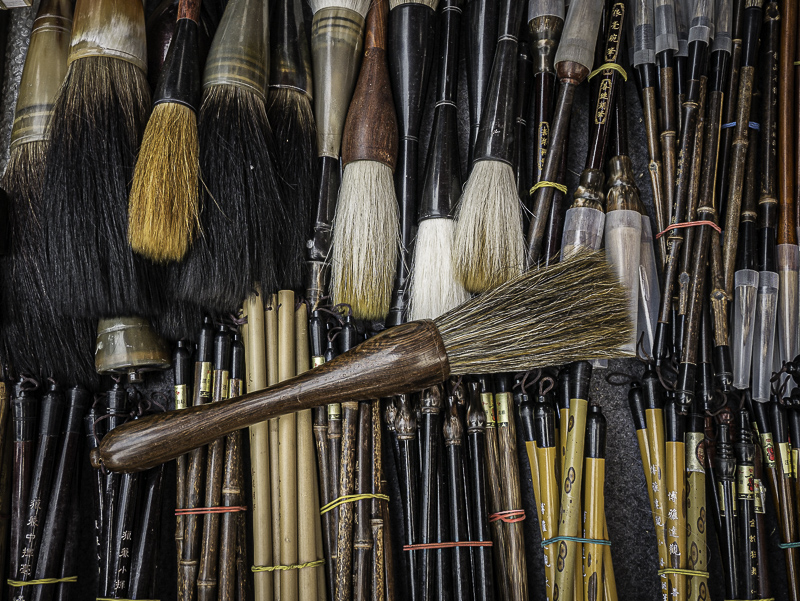
Original digital captureWhat I saw that I liked:An antiquities market in Beijing, China. I love both of these shots, but there is a difference. Can you see it? What I don't like in the picture:The one above has three areas of white where there are no combs. The white comes from the sheet spread on the ground on which these were being displayed. What I learned:I think it would be easy enough to fill in the white areas with a little Photoshop cloning. That is not as easy, however, as simply being aware of such compositional errors and covering up those holes with a bit of rearranging of the subject. The one at left is the same visual idea, but has complete coverage with the brushes. 2nd Chances: What I might try nextThis is an example of missing a fun possible mini-project. I could have found a dozen such compositions with different items. Too bad I wasn't thinking about this more carefully. I guess I'll just need to go back to China and try again! |


