Every Picture Is a Compromise
Lessons from the Also-rans
Most photography websites show the photographer's very best work. Wonderful. But that's not the full story of a creative life. If we want to learn, we'd better pay attention to the images that aren't "greatest hits" and see what lessons they have to offer. Every picture is a compromise — the sum of its parts, optical, technical, visual, emotional, and even cosmic – well, maybe not cosmic, but sometimes spiritual. Success on all fronts is rare. It's ok to learn from those that are not our best.
This is a series about my also-rans, some of which I've been able to improve at bit (i.e., "best effort"), none of which I would consider my best. With each there are lessons worth sharing, so I will.
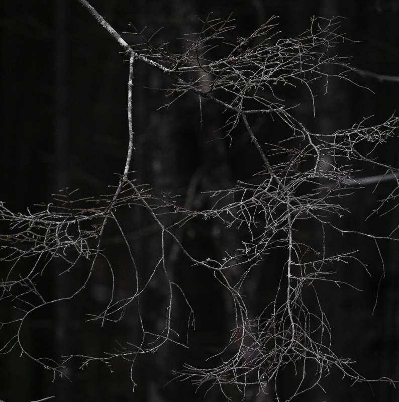
Original digital captureWhat I saw that I liked:White-ish branches against a dark-ish background. What I don't like in the picture:I don't think I really understood the visual concept of "emotional distance" until a few years ago. What I learned:There is nothing wrong with the image above, but it feels more distant (emotionally) than the one at left. The version at left feels like it is right there, I can almost touch it. The one above seems aloof. Curiously enough, the one above was shot at 179mm and the one at left was at 150mm. Based on this, you would think that the one above would feel closer — but it is the opposite. The right "emotional distance" is not a matter of optics, but also can be influenced by cropping, tones, details, and other subconscious senses we can't identify. I can't offer a definition, but I know it when I see it. |


