Every Picture Is a Compromise
Lessons from the Also-rans
Most photography websites show the photographer's very best work. Wonderful. But that's not the full story of a creative life. If we want to learn, we'd better pay attention to the images that aren't "greatest hits" and see what lessons they have to offer. Every picture is a compromise — the sum of its parts, optical, technical, visual, emotional, and even cosmic – well, maybe not cosmic, but sometimes spiritual. Success on all fronts is rare. It's ok to learn from those that are not our best.
This is a series about my also-rans, some of which I've been able to improve at bit (i.e., "best effort"), none of which I would consider my best. With each there are lessons worth sharing, so I will.
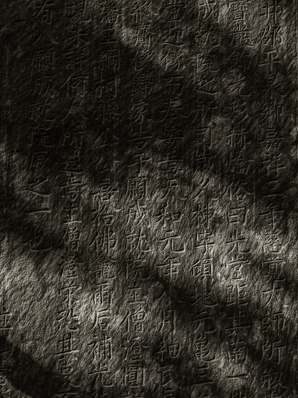
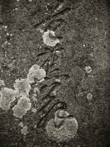
Original digital captureWhat I saw that I liked:I just love these carved stone tablets and markers that are found all over Japan. What I don't like in the picture:The example above is deep in shadow and therefore appears like a flat wall. The lack of light reduces the carved calligraphy to just a darker area of stone, perhaps even painted on. What I learned:The image at left with the sunlight scraping across the face of the rock gives the calligraphic carvings a more theatre-dimmensional effect. It also implies that the stone is found in a place surrounded by trees and that this moment was a sunny one. That's a lot of additional information from a shaft of sunlight! |


