Every Picture Is a Compromise
Lessons from the Also-rans
Most photography websites show the photographer's very best work. Wonderful. But that's not the full story of a creative life. If we want to learn, we'd better pay attention to the images that aren't "greatest hits" and see what lessons they have to offer. Every picture is a compromise — the sum of its parts, optical, technical, visual, emotional, and even cosmic – well, maybe not cosmic, but sometimes spiritual. Success on all fronts is rare. It's ok to learn from those that are not our best.
This is a series about my also-rans, some of which I've been able to improve at bit (i.e., "best effort"), none of which I would consider my best. With each there are lessons worth sharing, so I will.

Previous image | Next image |
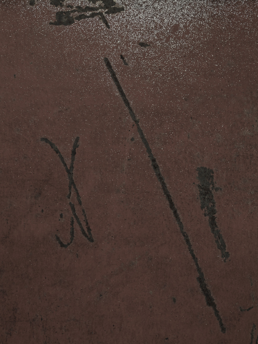
Original digital capture
Saturated Colors Week
I'm generally not a fan of hyper-real colors. Then again, sometimes a super saturated color is just the thing that's needed to jump start our imagination. This week will feature 5 images where truth and true color flew out the window in favor of exaggerated colors that fit the content and intent of the images.
What I saw that I liked:
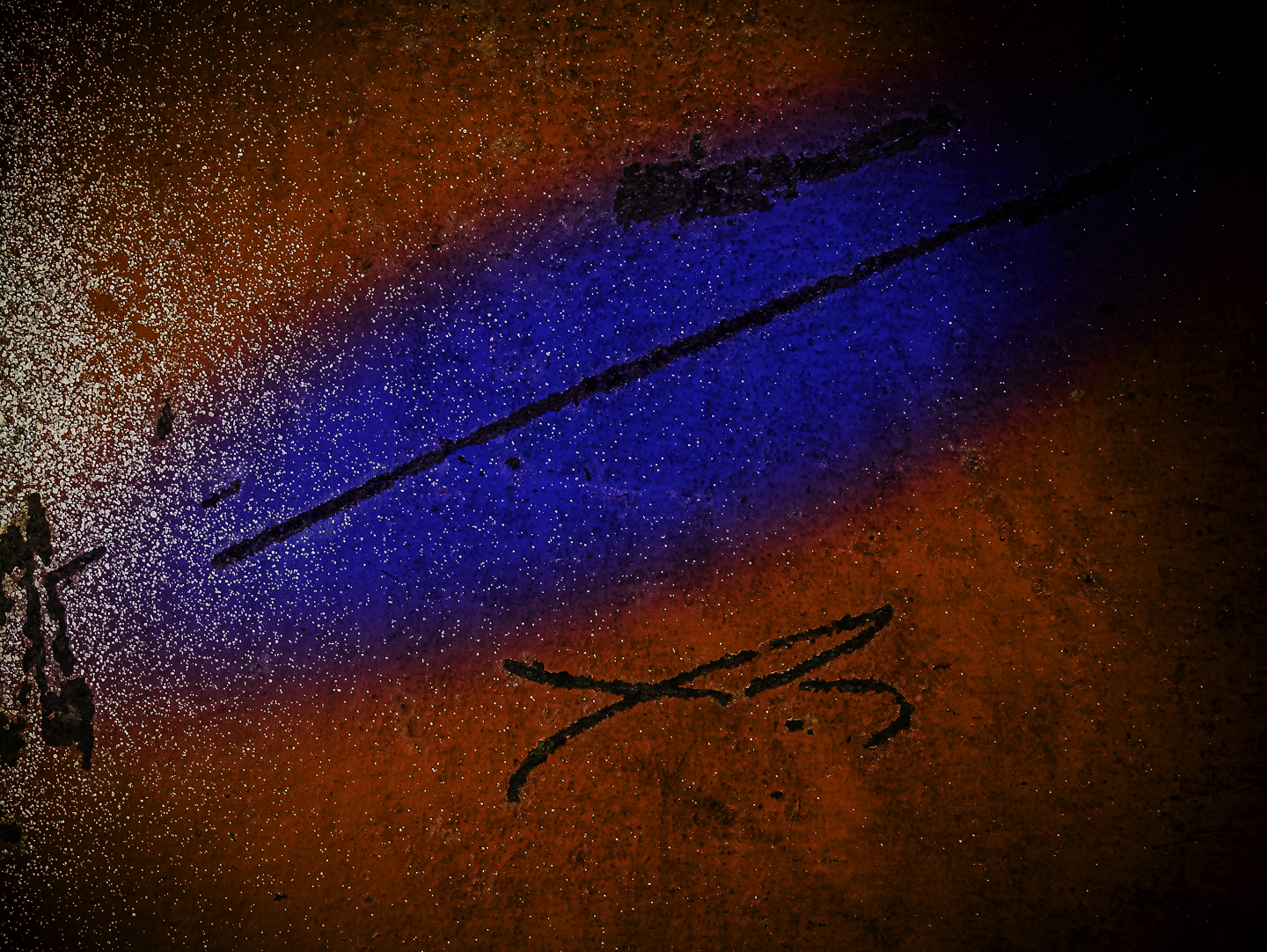
The original capture above is a mystery. I must have seen the lines as something interesting — although now that totally escape me.
What I don't like in the picture:
There is not one damn thing I like in the above.
What I learned:
This is an example of what I call "PBPA — Photograph By Pooping Around." With some pretty radical color intensification and the added blue, I immediately had a title for this image: A Rip in the Fabric of Space." I rarely title my prints so imaginatively, but this one seemed to demand it. This, by the way, also answer a chicken/egg question about photography. For me, the image always comes first and the title either pops into my head or it doesn't. |
|