Every Picture Is a Compromise
Lessons from the Also-rans
Most photography websites show the photographer's very best work. Wonderful. But that's not the full story of a creative life. If we want to learn, we'd better pay attention to the images that aren't "greatest hits" and see what lessons they have to offer. Every picture is a compromise — the sum of its parts, optical, technical, visual, emotional, and even cosmic – well, maybe not cosmic, but sometimes spiritual. Success on all fronts is rare. It's ok to learn from those that are not our best.
This is a series about my also-rans, some of which I've been able to improve at bit (i.e., "best effort"), none of which I would consider my best. With each there are lessons worth sharing, so I will.
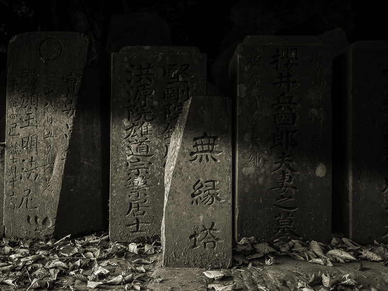
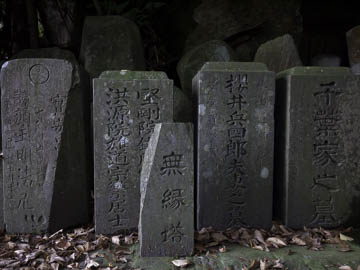
Original digital captureOrchestrating the Light WeekBeyond tonal correction with dodging and burning, we can also manufacture light that never existed. Huntington Witherill refers to this as "orchestrating the light." It might also be "creating shadows." I've used this idea on more than a few images where helping nature's somewhat bland light can liven up an image considerably. The trick is to make it believable — which I'm hoping I did in these examples. What I saw that I liked:These Japanese headstones are located inside a cave in the side of a hill. The only light was that leaking in from the door of the cave. What I don't like in the picture:The light in the above isn't bad, I just thought it could be a bit more dramatic. What I learned:One of the keys to adding directional shadows like this is to be sure the fake shadow blends with the light in the scene so they are at least going in the same direction. |


