Every Picture Is a Compromise
Lessons from the Also-rans
Most photography websites show the photographer's very best work. Wonderful. But that's not the full story of a creative life. If we want to learn, we'd better pay attention to the images that aren't "greatest hits" and see what lessons they have to offer. Every picture is a compromise — the sum of its parts, optical, technical, visual, emotional, and even cosmic – well, maybe not cosmic, but sometimes spiritual. Success on all fronts is rare. It's ok to learn from those that are not our best.
This is a series about my also-rans, some of which I've been able to improve at bit (i.e., "best effort"), none of which I would consider my best. With each there are lessons worth sharing, so I will.
|
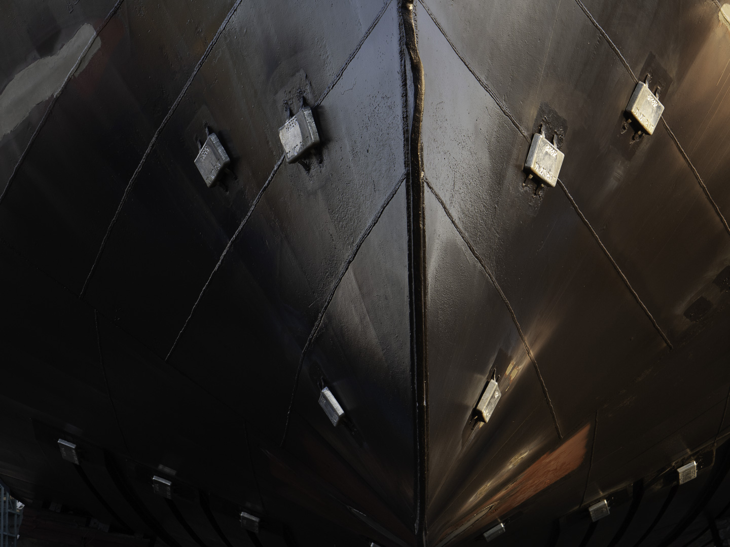
Original digital capture
Black and White Weekat the Dakota Creek shipyard The opportunities to photograph in color are everywhere. We see in color. All our RAW captures are in color. What are the decisions that lead to a b/w photograph? This week will feature 5 compositions that ended up as b/w images even though the color originals could have worked, too. What I saw that I liked:The keel under this ship created a lovely symmetric composition. What I don't like in the picture:The color version above is nice, but there is a red patch that has not yet been painted in the lower right. I suppose I could have desaturated that area, but conversion to b/w enhanced the sheen on the new black paint. What I learned:I didn't see that patch of red until I started working on the image in Lightroom. I was so single-mindedly concentrating on the keel line I completely missed the color in this image. Once I had converted it to b/w, I decided I liked it better that way anyway. |