Every Picture Is a Compromise
Lessons from the Also-rans
Most photography websites show the photographer's very best work. Wonderful. But that's not the full story of a creative life. If we want to learn, we'd better pay attention to the images that aren't "greatest hits" and see what lessons they have to offer. Every picture is a compromise — the sum of its parts, optical, technical, visual, emotional, and even cosmic – well, maybe not cosmic, but sometimes spiritual. Success on all fronts is rare. It's ok to learn from those that are not our best.
This is a series about my also-rans, some of which I've been able to improve at bit (i.e., "best effort"), none of which I would consider my best. With each there are lessons worth sharing, so I will.
|
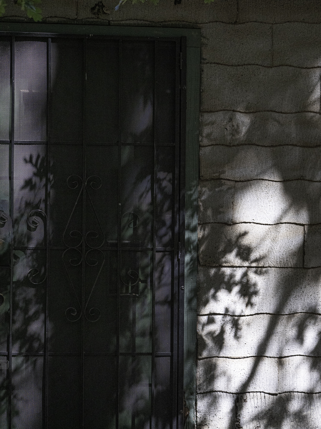
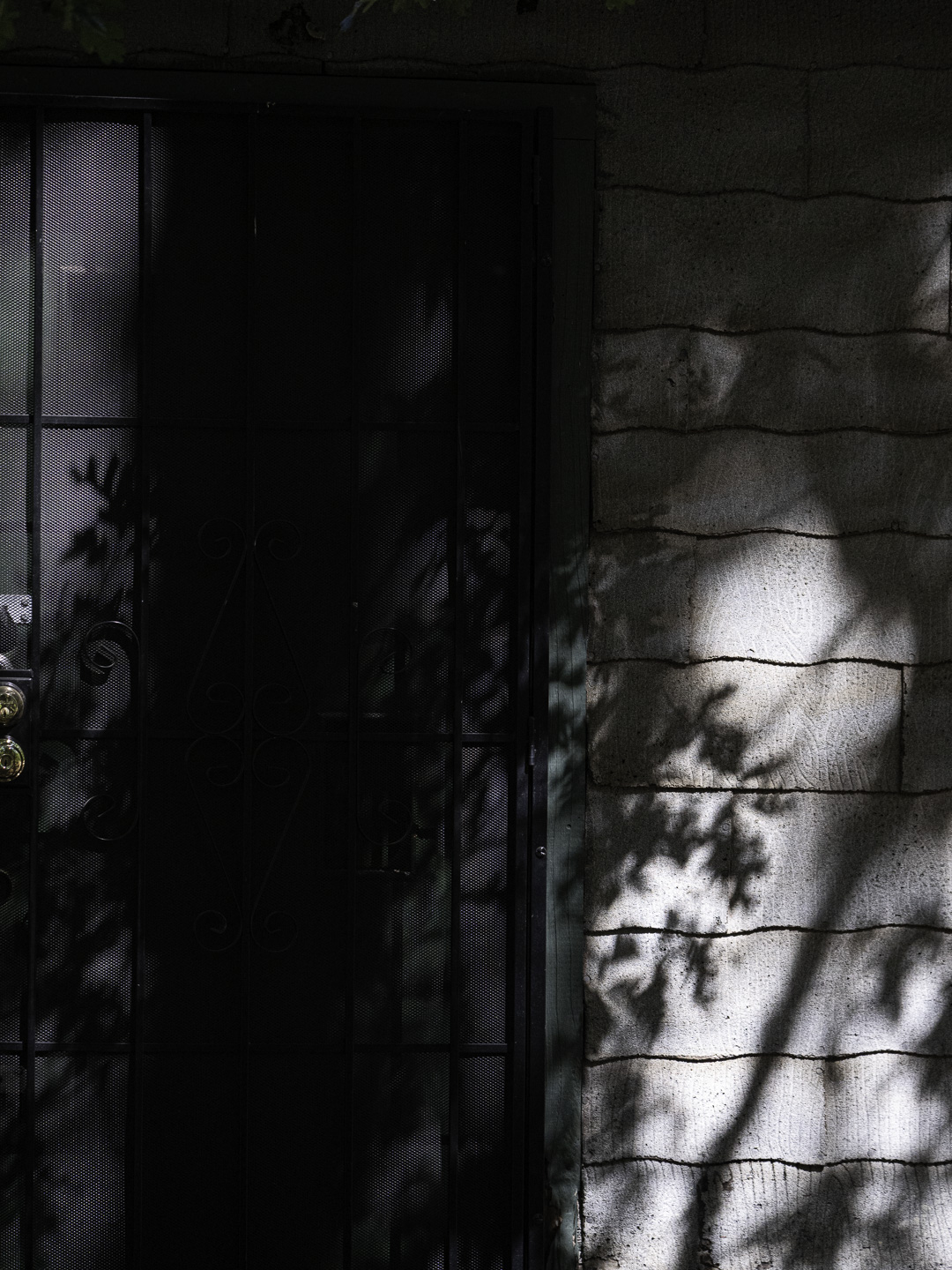
Original digital capture
What I saw that I liked:I'm drawn to light that penetrates the trees like this. I have lots of examples. What I don't like in the picture:In the version above, the light on the right side is overpowering and pulls the eye to the right. It needs more balanced illumination. What I learned:By "balanced illumination" I don't mean that the light needs to be even across the frame but rather that it needs to leave the composition balanced so the image doesn't feel like it wants to tip over. In this case, it was easy and simple to just pull up the shadows on the left to bring out some detail in the iron work and to lighten the left edge light a bit. 2nd Chances: What I might try nextIt's very subtle, but this is actually a color image. Should I punch up the colors to make them more visible? |