Every Picture Is a Compromise
Lessons from the Also-rans
Most photography websites show the photographer's very best work. Wonderful. But that's not the full story of a creative life. If we want to learn, we'd better pay attention to the images that aren't "greatest hits" and see what lessons they have to offer. Every picture is a compromise — the sum of its parts, optical, technical, visual, emotional, and even cosmic – well, maybe not cosmic, but sometimes spiritual. Success on all fronts is rare. It's ok to learn from those that are not our best.
This is a series about my also-rans, some of which I've been able to improve at bit (i.e., "best effort"), none of which I would consider my best. With each there are lessons worth sharing, so I will.
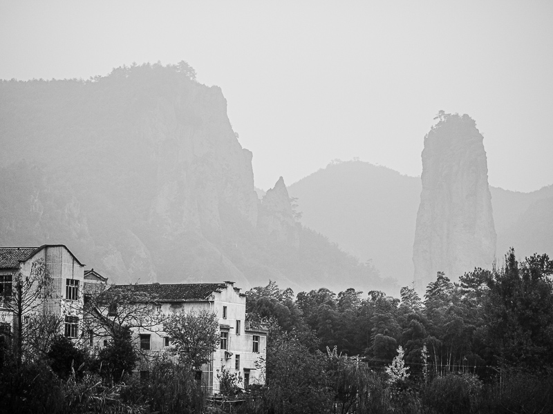
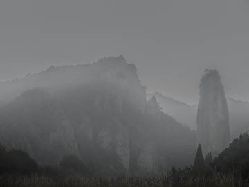
Original digital captureWhat I saw that I liked:Fun location in China on a very hazy day. What I don't like in the picture:With enough processing, I could probably make the above into an acceptable image. Maybe. I haven't tried yet. What I learned:The above version would need to have something interesting in the foreground in order to make the distant, hazy rocks a useful background. Rather than work with the above, I chose to use the image at left and its naturally more interesting foreground. 2nd Chances: What I might try nextThe light glow above the foreground trees in the middle looks like a processing mistake. It's not. There was a layer of fog behind the trees. Because it looks like a processing mistake, I would need to fix this with some detailed work to remove that fog. |


