Every Picture Is a Compromise
Lessons from the Also-rans
Most photography websites show the photographer's very best work. Wonderful. But that's not the full story of a creative life. If we want to learn, we'd better pay attention to the images that aren't "greatest hits" and see what lessons they have to offer. Every picture is a compromise — the sum of its parts, optical, technical, visual, emotional, and even cosmic – well, maybe not cosmic, but sometimes spiritual. Success on all fronts is rare. It's ok to learn from those that are not our best.
This is a series about my also-rans, some of which I've been able to improve at bit (i.e., "best effort"), none of which I would consider my best. With each there are lessons worth sharing, so I will.

Previous image | Next image |
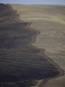
Original digital capture

Divided Composition
Most photographs are composed with some central subject seen against a background or a foreground. A much more rare kind of composition is when two sections of the composition almost seem like they are from different exposures. These "divided compositions" are a great technique for drawing comparisons.
What I saw that I liked:
The fire line.
What I don't like in the picture:
If divided compositions are all about comparisons, then the contrast between the two defines the success of the image.
What I learned:
increasing the contrast of this image divides it into two halves, but it also brings out the power lines more visibly. That and the sliver of sky makes this a more believable landscape.
2nd chances:
Still trying to decide if I should crop out that blue sky at the top.
|
|


