Every Picture Is a Compromise
Lessons from the Also-rans
Most photography websites show the photographer's very best work. Wonderful. But that's not the full story of a creative life. If we want to learn, we'd better pay attention to the images that aren't "greatest hits" and see what lessons they have to offer. Every picture is a compromise — the sum of its parts, optical, technical, visual, emotional, and even cosmic – well, maybe not cosmic, but sometimes spiritual. Success on all fronts is rare. It's ok to learn from those that are not our best.
This is a series about my also-rans, some of which I've been able to improve at bit (i.e., "best effort"), none of which I would consider my best. With each there are lessons worth sharing, so I will.


Previous image | Next image |
Original digital capture

Panorama Week
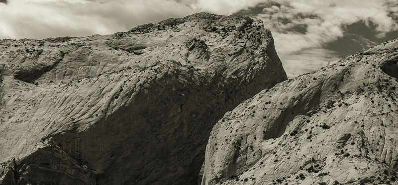
For the last couple of weeks, I've been discussing square format images. This week I visit the opposite end of the format spectrum by concentrating on the panorama format. There is no consensus on the "correct" aspect ratio for panorama images, but I find I tend to use my personal favorite most often — a ratio of 2.15:1. I have no logic for this ratio, I just like it!
What I saw that I liked:
This is the Waterpocket Fold in Capitol reef.
What I don't like in the picture:
I have a super-long panorama of this geological structure that is an absurdly long 7:1 aspect ratio that prints to 8-feet by 13-inches. It's fun, but unwieldy to show.
What I learned:
With digital printers and roll paper, we can make incredibly long panorama images. We can, but how to exhibit them? Matting and framing is almost laughable — certainly a novelty piece. An image like this one produced in a more reasonable pano like 2.15:1 is a lot easier to frame and exhibit.
2nd Chances: What I might try next
Maybe I should explore the 7:1 aspect ratio some more and see if I can find a gallery that would be interested? |
|


