Every Picture Is a Compromise
Lessons from the Also-rans
Most photography websites show the photographer's very best work. Wonderful. But that's not the full story of a creative life. If we want to learn, we'd better pay attention to the images that aren't "greatest hits" and see what lessons they have to offer. Every picture is a compromise — the sum of its parts, optical, technical, visual, emotional, and even cosmic – well, maybe not cosmic, but sometimes spiritual. Success on all fronts is rare. It's ok to learn from those that are not our best.
This is a series about my also-rans, some of which I've been able to improve at bit (i.e., "best effort"), none of which I would consider my best. With each there are lessons worth sharing, so I will.

Previous image | Next image |
Original digital capture

Panorama Week
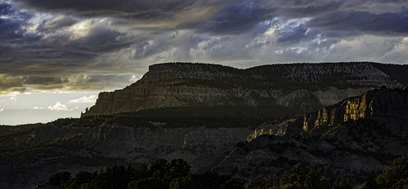
For the last couple of weeks, I've been discussing square format images. This week I visit the opposite end of the format spectrum by concentrating on the panorama format. There is no consensus on the "correct" aspect ratio for panorama images, but I find I tend to use my personal favorite most often — a ratio of 2.15:1. I have no logic for this ratio, I just like it!
What I saw that I liked:
Lovely late light in Utah's gorgeous canyon country.
What I don't like in the picture:
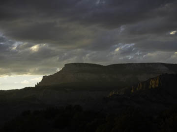
First, I didn't get the exposure right, but that's easy to fix. Second, the more I looked at this image the more I realized the top and bottom were not contributing.
What I learned:
Wanting to convert this to a panorama image, I first tried the standard 16:9 aspect ratio, but that wasn't wide enough. Then I tried 3:1 and that was too skinny. I tried 2.5:1, but it cropped in just a smidge too much. This was the first image I cropped to 2.15:1 and just loved this as a nice panorama standard. I'm not locked in on 2.15:1, but I find I use that aspect ratio far more than others when I want to go pano.
2nd Chances: What I might try next
Maybe I should work on the clouds in the upper right to bring a bit more drama to them to match the clouds in the upper left. |
|


