Every Picture Is a Compromise
Lessons from the Also-rans
Most photography websites show the photographer's very best work. Wonderful. But that's not the full story of a creative life. If we want to learn, we'd better pay attention to the images that aren't "greatest hits" and see what lessons they have to offer. Every picture is a compromise — the sum of its parts, optical, technical, visual, emotional, and even cosmic – well, maybe not cosmic, but sometimes spiritual. Success on all fronts is rare. It's ok to learn from those that are not our best.
This is a series about my also-rans, some of which I've been able to improve at bit (i.e., "best effort"), none of which I would consider my best. With each there are lessons worth sharing, so I will.

Previous image | Next image |
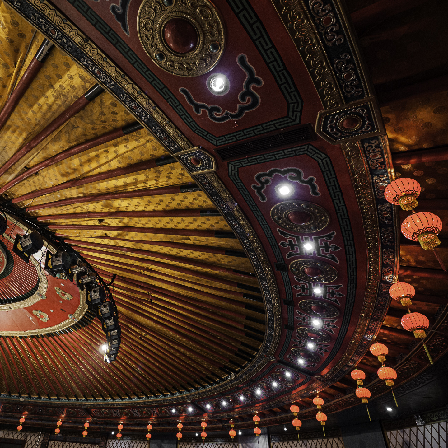
Original digital capture
Squares and Circles Week
In a recent Here's a Thought... commentary I discussed the square format and the use of diagonals. This week I'll illustrate a similar idea using the square 1:1 aspect ratio image with circles and curves in the composition.
What I saw that I liked:
In a dining hall in inner-Mongolia.
What I don't like in the picture:
Actually, I like the above pretty well except for one little niggle I wish were not there. Notice the bright light in the very lower left corner. I suppose I could have carefully cloned that out.
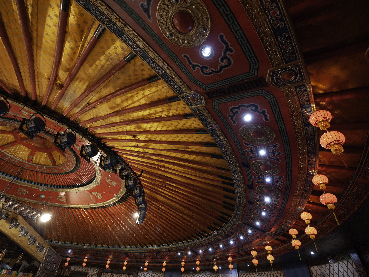
What I learned:
Instead, I decided to crop it out. I was surprised that in doing so, the image with the square format feels like I am so much closer to it. Is this an optical illusion of some kind? Not sure, but look at the round decoration at the top, just left of center. Doesn't that look way closer than the same fixture in the above? Maybe it's just me. |
|