Every Picture Is a Compromise
Lessons from the Also-rans
Most photography websites show the photographer's very best work. Wonderful. But that's not the full story of a creative life. If we want to learn, we'd better pay attention to the images that aren't "greatest hits" and see what lessons they have to offer. Every picture is a compromise — the sum of its parts, optical, technical, visual, emotional, and even cosmic – well, maybe not cosmic, but sometimes spiritual. Success on all fronts is rare. It's ok to learn from those that are not our best.
This is a series about my also-rans, some of which I've been able to improve at bit (i.e., "best effort"), none of which I would consider my best. With each there are lessons worth sharing, so I will.

Previous image | Next image |
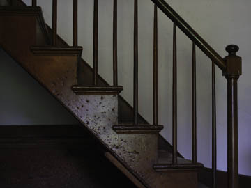
Original digital capture

Squares and Diagonals Week
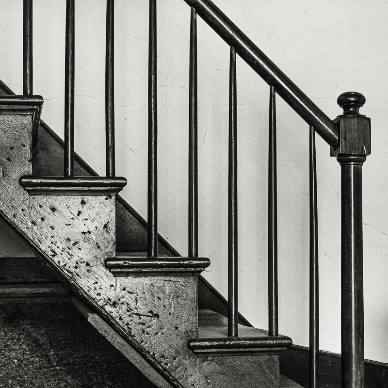
In a recent Here's a Thought... commentary I discussed the square format and the use of diagonals. This week I'll illustrate this with examples all using a 1:1 aspect ratio with a strong diagonal in the composition.
What I saw that I liked:
In the Hancock Shaker Village. Lots of old and very cool stuff and architecture.
What I don't like in the picture:
Obviously, I didn't get the exposure correct in the above. The more I worked on it, the more I came to realize that the left side of the image could be cropped out without loosing anything.
What I learned:
My camera has the ability to show cropping lines for several different formats, 1:1 being just one of them. I wonder if it's better to set up the camera to show its native aspect ration and then vary to, say, 1:1 in the field on occasion? Or would it be better to set a 1:1 as the default cropping view and expand that when the composition requires it? This is going to require some in-the-field testing. |
|


