Every Picture Is a Compromise
Lessons from the Also-rans
Most photography websites show the photographer's very best work. Wonderful. But that's not the full story of a creative life. If we want to learn, we'd better pay attention to the images that aren't "greatest hits" and see what lessons they have to offer. Every picture is a compromise — the sum of its parts, optical, technical, visual, emotional, and even cosmic – well, maybe not cosmic, but sometimes spiritual. Success on all fronts is rare. It's ok to learn from those that are not our best.
This is a series about my also-rans, some of which I've been able to improve at bit (i.e., "best effort"), none of which I would consider my best. With each there are lessons worth sharing, so I will.

Previous image | Next image |
Original digital capture

Get Closer Week
Any advice that is supposed to be universal is probably bad advice. That said, I think there are very few pictures that aren't improved by moving closer. This week's examples might help illustrate the wisdom of simply taking a step or two toward the subject, or at least zooming in a bit.
What I saw that I liked:
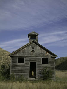
An old school along the side of the road in Montana.
What I don't like in the picture:
Photographing an old structure like this is always fun, but it's mostly about the architecture. What I'd much rather photograph is the feeling of being a part of its history.
What I learned:
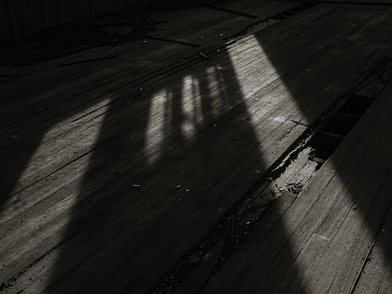
With few exceptions, the first person experiential experience requires photographing inside the abandoned building, not just its view from the road. Sometimes, "getting closer" means "getting inside."
2nd Chances: What I might try next
The white dots in the image at left are bits of broken glass scattered on the floor. Do I leave them, make more of them, spot them out? |
|


