Every Picture Is a Compromise
Lessons from the Also-rans
Most photography websites show the photographer's very best work. Wonderful. But that's not the full story of a creative life. If we want to learn, we'd better pay attention to the images that aren't "greatest hits" and see what lessons they have to offer. Every picture is a compromise — the sum of its parts, optical, technical, visual, emotional, and even cosmic – well, maybe not cosmic, but sometimes spiritual. Success on all fronts is rare. It's ok to learn from those that are not our best.
This is a series about my also-rans, some of which I've been able to improve at bit (i.e., "best effort"), none of which I would consider my best. With each there are lessons worth sharing, so I will.
Previous image | Next image |
Original digital capture
Get Closer Week
Any advice that is supposed to be universal is probably bad advice. That said, I think there are very few pictures that aren't improved by moving closer. This week's examples might help illustrate the wisdom of simply taking a step or two toward the subject, or at least zooming in a bit.
What I saw that I liked:
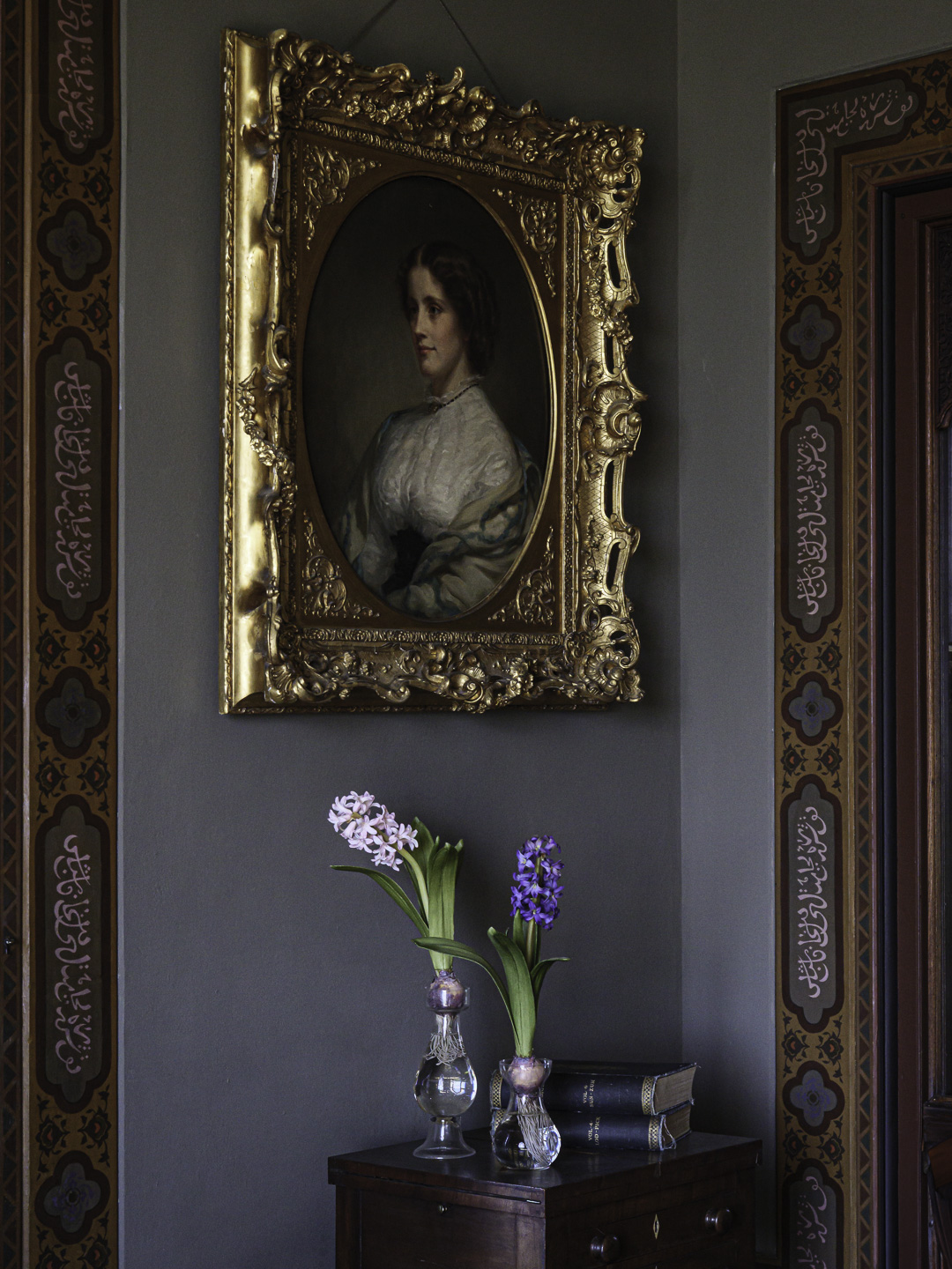
At Olana historic home. Very formal, very 19th century luxury.
What I don't like in the picture:
I like the one above as an architectural description, but I find my image a bit emotionless.
What I learned:
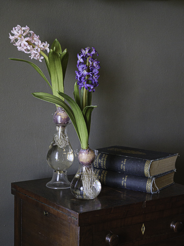
Sometimes saying less leads to saying more. The image at left eliminates the door sills and the painting, but places the viewer more in touch with the light and the tactile feel of the setting. I could definitely find a use for each of these, but in completely different projects based on their respective moods.
2nd Chances: What I might try next
Do I keep the diamond-shaped lock in the drawer? Tone it down? Leave it as is? |
|