Every Picture Is a Compromise
Lessons from the Also-rans
Most photography websites show the photographer's very best work. Wonderful. But that's not the full story of a creative life. If we want to learn, we'd better pay attention to the images that aren't "greatest hits" and see what lessons they have to offer. Every picture is a compromise — the sum of its parts, optical, technical, visual, emotional, and even cosmic – well, maybe not cosmic, but sometimes spiritual. Success on all fronts is rare. It's ok to learn from those that are not our best.
This is a series about my also-rans, some of which I've been able to improve at bit (i.e., "best effort"), none of which I would consider my best. With each there are lessons worth sharing, so I will.
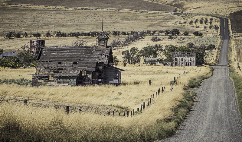
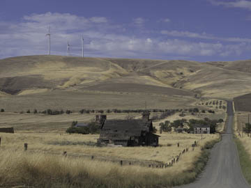
Original digital captureWhat I saw that I liked:The parallel lines of the road, the fence, and the lines of trees. What I don't like in the picture:The windmills seem to pull this image in the wrong direction. What I learned:As I've mentioned elsewhere, one of the most fundamental decisions with every landscape is whether or not to include the sky. In this case, it was an easy decision to just eliminate both the sky and the windmills. 2nd Chances: What I might try nextI suppose I could have cloned out the windmills, but I prefer the geometries of the land forms. |


