Every Picture Is a Compromise
Lessons from the Also-rans
Most photography websites show the photographer's very best work. Wonderful. But that's not the full story of a creative life. If we want to learn, we'd better pay attention to the images that aren't "greatest hits" and see what lessons they have to offer. Every picture is a compromise — the sum of its parts, optical, technical, visual, emotional, and even cosmic – well, maybe not cosmic, but sometimes spiritual. Success on all fronts is rare. It's ok to learn from those that are not our best.
This is a series about my also-rans, some of which I've been able to improve at bit (i.e., "best effort"), none of which I would consider my best. With each there are lessons worth sharing, so I will.

Previous image | Next image |
Personally Expressive Week
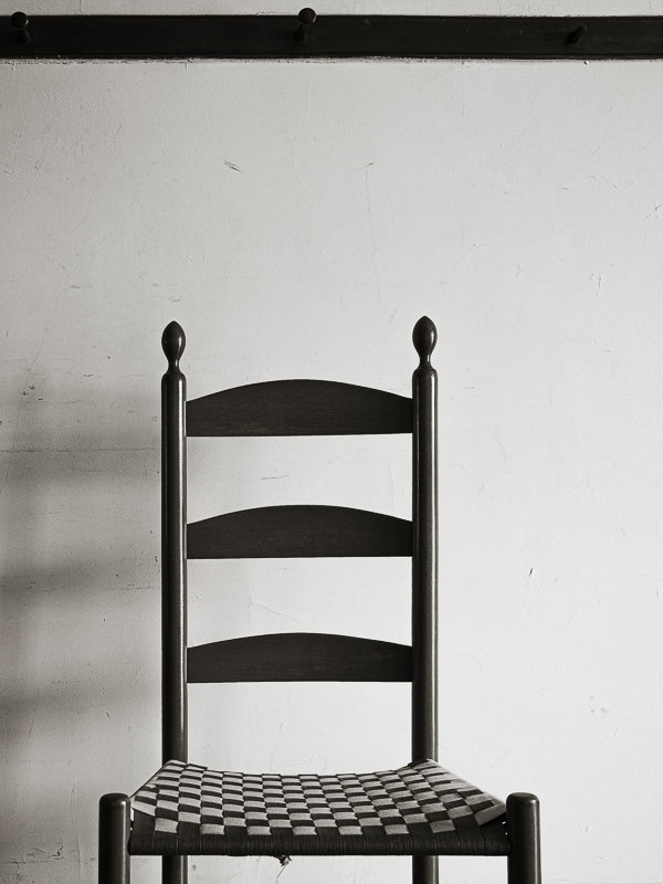
This week we'll look at pairs of images from the same locations — one made by my friend Joe Lipka and the other by me. We each have our own vision and aesthetic. Said another way, in art there are no right or wrong answers. There are, however, personal expressions that can be true to your own vision and your honest response to the world. Brooks' image

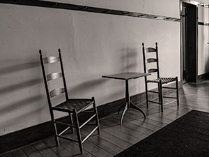
Joe's image

Things to notice:
Here is an example of my preference for minimalism as compared to Joe's wide-angle contextual representation. His image reveals more of the shadows from the window off to the right, thereby emphasizing the light and its direction. My is less about the light but draws more attention to the geometry of the chair. Here again, both points of view are valid and each images succeeds at different objectives. We both chose b/w for this subject, but Joe's is slightly reddish whereas mine is slightly yellowish. Brown is such a tricky color!
Visit Joe's website. |
|

