Every Picture Is a Compromise
Lessons from the Also-rans
Most photography websites show the photographer's very best work. Wonderful. But that's not the full story of a creative life. If we want to learn, we'd better pay attention to the images that aren't "greatest hits" and see what lessons they have to offer. Every picture is a compromise — the sum of its parts, optical, technical, visual, emotional, and even cosmic – well, maybe not cosmic, but sometimes spiritual. Success on all fronts is rare. It's ok to learn from those that are not our best.
This is a series about my also-rans, some of which I've been able to improve at bit (i.e., "best effort"), none of which I would consider my best. With each there are lessons worth sharing, so I will.

Previous image | Next image |
Personally Expressive Week
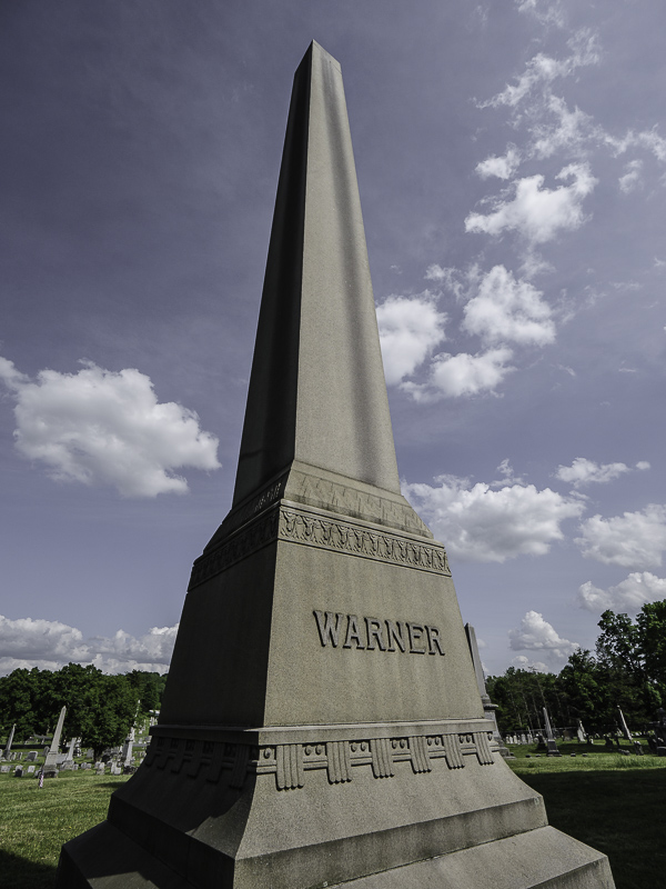
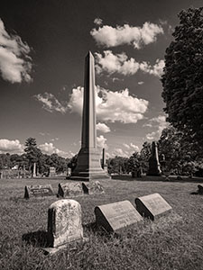
This week we'll look at pairs of images from the same locations — one made by my friend Joe Lipka and the other by me. We each have our own vision and aesthetic. Said another way, in art there are no right or wrong answers. There are, however, personal expressions that can be true to your own vision and your honest response to the world. Brooks' image

Joe's image

Things to notice:
Joe tends to see wide-angle. As such his images generally do a better job than mine in showing location and context. His image shows the three grave markers in front that are missing from mine, however, in mine you can more easily see the person's name on the obelisk. Both of these images work, but are different in the primary message they convey. In addition, Joe chose b/w for his rendition in order to emphasize the clouds where I muted the saturation of the blue sky to reduce the attention to the clouds.
Visit Joe's website. |
|


