Every Picture Is a Compromise
Lessons from the Also-rans
Most photography websites show the photographer's very best work. Wonderful. But that's not the full story of a creative life. If we want to learn, we'd better pay attention to the images that aren't "greatest hits" and see what lessons they have to offer. Every picture is a compromise — the sum of its parts, optical, technical, visual, emotional, and even cosmic – well, maybe not cosmic, but sometimes spiritual. Success on all fronts is rare. It's ok to learn from those that are not our best.
This is a series about my also-rans, some of which I've been able to improve at bit (i.e., "best effort"), none of which I would consider my best. With each there are lessons worth sharing, so I will.

Previous image | Next image |
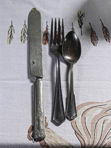
Original digital capture

It's What You Make Week
The theme this week revolves around the idea that it's not what you take, but what you make that counts. All the images this week are ones that required radical processing to pull something interesting out of a blah RAW capture.
What I saw that I liked:
I know, nostalgia on parade. I like to think of these images as my homage to Wright Morris who did it so much better.
What I don't like in the RAW capture:
The original in color dates this as a modern image photographed with modern color rendition. The feel I wanted, of course, was older, something from the 1920s or 1930s. Warm tone b/w seemed the obvious answer
What I made:
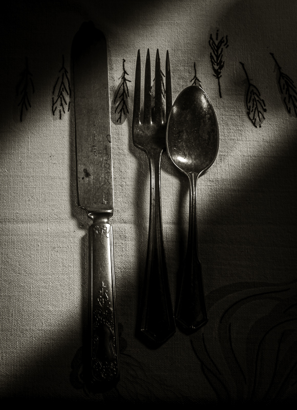
Even with the warm tone added, the image above was sterile. Adding the dramatic light made the image more about a moment. This was done by simply burning in the upper left and the lower right with a couple of linear gradients. The natural shadows of the silverware give the light direction. To my eye, it looks like this is a sunbeam coming through a window off to the right. Another example of "orchestrating the light." This light also reduces the patterns in the table cloth and pulls our attention more to the silverware. |
|


