Every Picture Is a Compromise
Lessons from the Also-rans
Most photography websites show the photographer's very best work. Wonderful. But that's not the full story of a creative life. If we want to learn, we'd better pay attention to the images that aren't "greatest hits" and see what lessons they have to offer. Every picture is a compromise — the sum of its parts, optical, technical, visual, emotional, and even cosmic – well, maybe not cosmic, but sometimes spiritual. Success on all fronts is rare. It's ok to learn from those that are not our best.
This is a series about my also-rans, some of which I've been able to improve at bit (i.e., "best effort"), none of which I would consider my best. With each there are lessons worth sharing, so I will.

Previous image | Next image |
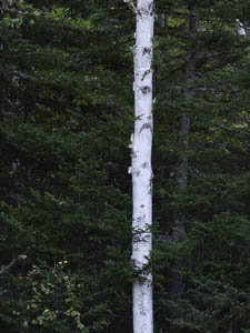
Original digital capture

The Miracles of Technology Week
Lens Blur
I've said for years that this is the best time in the history of photography to be a photographer. This week, I'll share an additional five "failures" that were rescued/improved by the miracles of software.
What I saw that I liked:
That white bark against the darker background evergreens.
What I don't like in the picture:
Here again, there was no doubt I wanted this image in b/w rather than in green/white. When I converted the image to b/w, the background became a busy distraction.
What I learned:
I darkened it some more, but just couldn't get the white tree to separate from the background like I would have preferred. The new Lens Blur tool in Lightroom came to my rescue. Thanks, Adobe. This kind of creative adjust was simply impossible in the wet darkroom — at least by any technique I'm aware of. Going sharp to blurred is now easy and doesn't have to be done with optical depth of field.
2nd Chances: What I might try next
There are two white dots in the lower left that look to me to be alien's eyeballs. I need to clone them out. |
|


