Every Picture Is a Compromise
Lessons from the Also-rans
Most photography websites show the photographer's very best work. Wonderful. But that's not the full story of a creative life. If we want to learn, we'd better pay attention to the images that aren't "greatest hits" and see what lessons they have to offer. Every picture is a compromise — the sum of its parts, optical, technical, visual, emotional, and even cosmic – well, maybe not cosmic, but sometimes spiritual. Success on all fronts is rare. It's ok to learn from those that are not our best.
This is a series about my also-rans, some of which I've been able to improve at bit (i.e., "best effort"), none of which I would consider my best. With each there are lessons worth sharing, so I will.
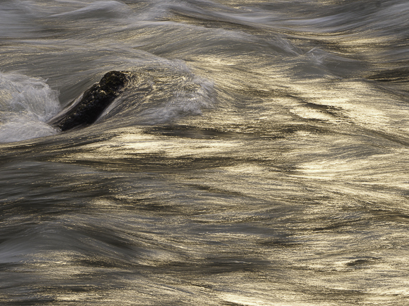
Original digital captureWhat I saw that I liked:Stumbling upon something wonderful is fun. What I don't like in the picture:Here are two examples of the same issue — questionable believeablity. That feather was on the leave just as I found it — but doesn't it look like I might have placed it there on purpose? At left, the golden water is not a Photoshop trick. It was a smoky day after heavy forest fires. The sunlight was filtered through all that smoke making a golden light I'd never seen before What I learned:Both of these photographs suffer from unbelievability. They look fake even though they are both "straight" photographs. This is one of the consequences of so many photographers pushing digital photography to such extremes — particularly of vibrance and layered recombinants. The genie is out of the bottle and there is nothing we can do about it now. Too bad because I like both of these images and probably won't use either of them because they will so easily be seen as photo fakes. |


