Every Picture Is a Compromise
Lessons from the Also-rans
Most photography websites show the photographer's very best work. Wonderful. But that's not the full story of a creative life. If we want to learn, we'd better pay attention to the images that aren't "greatest hits" and see what lessons they have to offer. Every picture is a compromise — the sum of its parts, optical, technical, visual, emotional, and even cosmic – well, maybe not cosmic, but sometimes spiritual. Success on all fronts is rare. It's ok to learn from those that are not our best.
This is a series about my also-rans, some of which I've been able to improve at bit (i.e., "best effort"), none of which I would consider my best. With each there are lessons worth sharing, so I will.
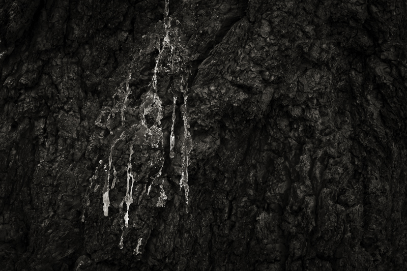
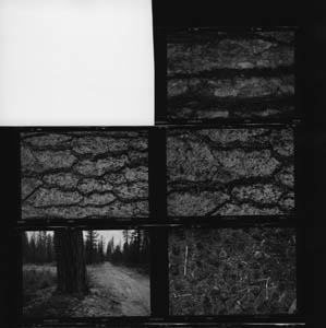
Original digital capturePictures Come from Pictures WeekThis week will see the 1,000th post in this series, so it seems like a good time to scan back — way back — to my beginnings. Each day I'll look at a contact sheet (above) from my film archives and compare it to a more recent image of the same visual idea. There is nothing new under the sun, or as Carl Chiarenza says, "Pictures come from pictures." The contact sheets are all from the mid-1980s or 90s. The revisited images at left are all digital images after 2005. The Backstory:I remember years ago seeing an Ansel Adams image of a burnt tree stump. I thought it was great the way he was able to make black out of dark gray tones. I'm assuming that's why I have lots of burnt tree trunk photographs — that I'd never done anything with because they just didn't glow like Adams' did. The one above (from 1995) has potential, but I never printed it in my darkroom. Then in 2008, I did a project titled, Silva Lacrimosa, Latin for Tears of the Forest. The image at left was the inspiration for the title and the project. I spent weeks trying to get just the right tones. That was a great deal easier to accomplish in the digital workflow than my failed attempts in the wet darkroom. |


