Every Picture Is a Compromise
Lessons from the Also-rans
Most photography websites show the photographer's very best work. Wonderful. But that's not the full story of a creative life. If we want to learn, we'd better pay attention to the images that aren't "greatest hits" and see what lessons they have to offer. Every picture is a compromise — the sum of its parts, optical, technical, visual, emotional, and even cosmic – well, maybe not cosmic, but sometimes spiritual. Success on all fronts is rare. It's ok to learn from those that are not our best.
This is a series about my also-rans, some of which I've been able to improve at bit (i.e., "best effort"), none of which I would consider my best. With each there are lessons worth sharing, so I will.
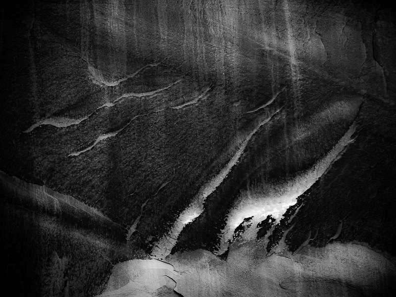
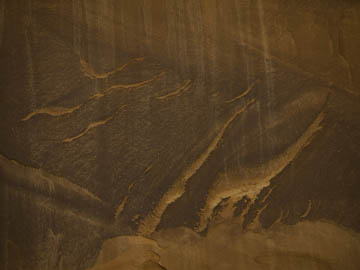
Original digital captureWhat I saw that I liked:Line and form are always the key when capturing an image that might become an abstract. What I don't like in the picture:In the above, the color is bland and the contrast is weak. What I learned:For the millionth time, "It's not what you take; it's what you make." This processed image feels like a dynamic seascape, or perhaps a waterfall. I tentatively titled this image, The Effects of Gravity. It is, in that the water running down this sandstone wall has carved these shapes. The metaphorical entendre is that in the finished image at left, the whites look more like running water. |


