Every Picture Is a Compromise
Lessons from the Also-rans
Most photography websites show the photographer's very best work. Wonderful. But that's not the full story of a creative life. If we want to learn, we'd better pay attention to the images that aren't "greatest hits" and see what lessons they have to offer. Every picture is a compromise — the sum of its parts, optical, technical, visual, emotional, and even cosmic – well, maybe not cosmic, but sometimes spiritual. Success on all fronts is rare. It's ok to learn from those that are not our best.
This is a series about my also-rans, some of which I've been able to improve at bit (i.e., "best effort"), none of which I would consider my best. With each there are lessons worth sharing, so I will.
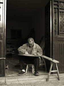
Original digital captureGet Closer WeekAny advice that is supposed to be universal is probably bad advice. That said, I think there are very few pictures that aren't improved by moving closer. This week's examples might help illustrate the wisdom of simply taking a step or two toward the subject, or at least zooming in a bit. What I saw that I liked:This was down an alley in a small Chinese village out in the country. There were lots of people doing hand work like this. What I don't like in the picture:I remember composing the one above so I could get in the saw horse table to his left. I didn't do a very precise job of composing. Distracting elements on the left. Too much black in the doorway above him. What I learned:I smiled, greet him with a Chinese, "Ni hao!" and stepped closer to make this image. He didn't mind at all. I found everyone in China to be accommodating and friendly. 2nd Chances: What I might try nextI was lucky that his hands and his face were in the same plane of focus. This was shot at f/5.6 on my m4/3 camera — eq. of 11. Just enough depth of field. Notice his ear is out of focus. |


