Every Picture Is a Compromise
Lessons from the Also-rans
Most photography websites show the photographer's very best work. Wonderful. But that's not the full story of a creative life. If we want to learn, we'd better pay attention to the images that aren't "greatest hits" and see what lessons they have to offer. Every picture is a compromise — the sum of its parts, optical, technical, visual, emotional, and even cosmic – well, maybe not cosmic, but sometimes spiritual. Success on all fronts is rare. It's ok to learn from those that are not our best.
This is a series about my also-rans, some of which I've been able to improve at bit (i.e., "best effort"), none of which I would consider my best. With each there are lessons worth sharing, so I will.
|
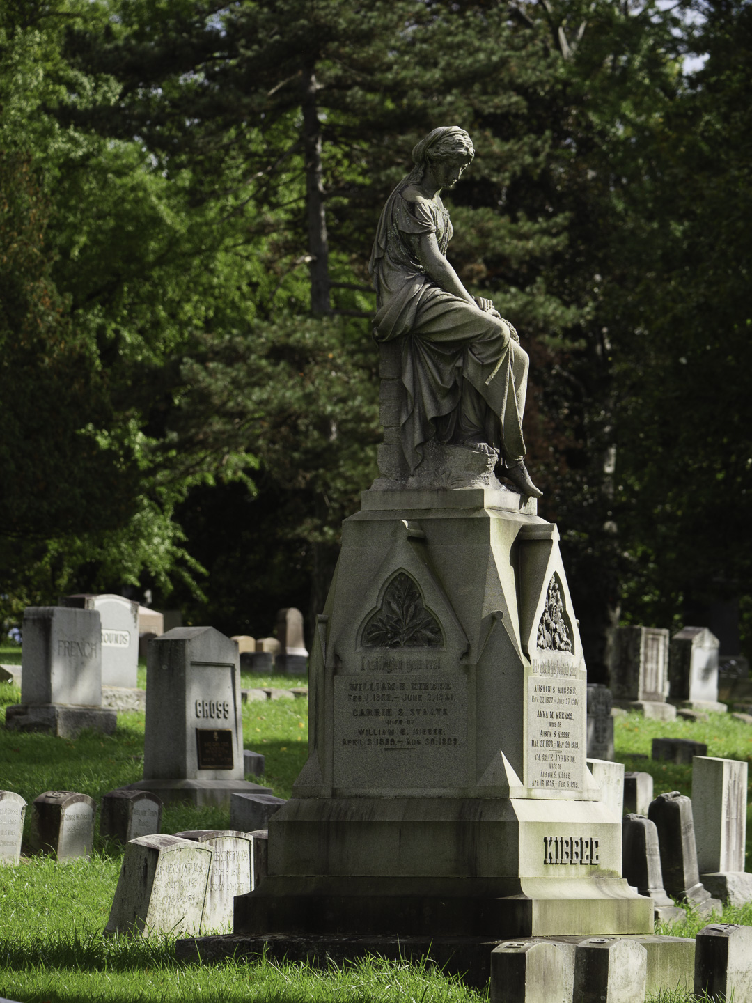
Original digital capture
Get Closer WeekAny advice that is supposed to be universal is probably bad advice. That said, I think there are very few pictures that aren't improved by moving closer. This week's examples might help illustrate the wisdom of simply taking a step or two toward the subject, or at least zooming in a bit. What I saw that I liked:This cemetery was chock full of statues. What I don't like in the picture:In the above, I can't really see the expression on her face very well. That diminishes the human emotion aspect of this image. What I learned:Moving closer and from a slightly forward angle allows her face to emerge from the shadows. The angle of her arm is a terrific compositional element. 2nd Chances: What I might try nextBy removing the headstones from around her, have I lost the context of where she appears? I suppose I could resolve that with an image title that includes the word "cemetery" in it somewhere. |