Every Picture Is a Compromise
Lessons from the Also-rans
Most photography websites show the photographer's very best work. Wonderful. But that's not the full story of a creative life. If we want to learn, we'd better pay attention to the images that aren't "greatest hits" and see what lessons they have to offer. Every picture is a compromise — the sum of its parts, optical, technical, visual, emotional, and even cosmic – well, maybe not cosmic, but sometimes spiritual. Success on all fronts is rare. It's ok to learn from those that are not our best.
This is a series about my also-rans, some of which I've been able to improve at bit (i.e., "best effort"), none of which I would consider my best. With each there are lessons worth sharing, so I will.
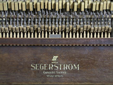
Original digital captureWhat I saw that I liked:I made a number of compositions of this old piano. What I don't like in the picture:Not sure why I thought I needed the manufacturer's logo, but it did provide a point for bilateral symmetry. An example of thinking too much about the composition and not enough about the subject. What I learned:After I lifted the cover, the guts of the piano were fascinating. I let go of symmetry and the need to include the entire text of the manufacturer's name. This also allowed me to get closer where the hand-written signature could be more visible. 2nd Chances: What I might try nextI have a lot of piano photographs. Must be something left over from my childhood when I quit my piano lessons after just a few months — in spite of my mother's protests. By the way, same FujiFilm S602 camera from the last few days. |


