Every Picture Is a Compromise
Lessons from the Also-rans
Most photography websites show the photographer's very best work. Wonderful. But that's not the full story of a creative life. If we want to learn, we'd better pay attention to the images that aren't "greatest hits" and see what lessons they have to offer. Every picture is a compromise — the sum of its parts, optical, technical, visual, emotional, and even cosmic – well, maybe not cosmic, but sometimes spiritual. Success on all fronts is rare. It's ok to learn from those that are not our best.
This is a series about my also-rans, some of which I've been able to improve at bit (i.e., "best effort"), none of which I would consider my best. With each there are lessons worth sharing, so I will.
|
Previous image | Next image |
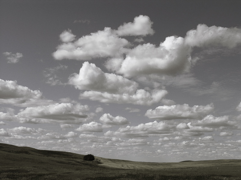
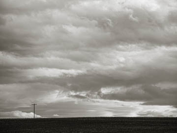
Original digital captureSky WeekSo many times the success of a landscape is actually a function of the sky. It would be odd to call them "skyscapes," but we can think of them that way and very probably improve our photographs. This week, we'll look at sky failures. What I saw that I liked:Lovely lone telephone pole in North Dakota. What I don't like in the picture:I have always preferred warm-toned images when it comes to b/w. A neutral grayscale image is more common and lots of photographers prefer neutral grays. There is one area where I agree with them, and that is in the sky. The "brown" clouds in the above are okay, but not quite right. What I learned:When I did my video project Hope Eternal, I played around with neutral gray skies with just a tiny bit of blue. I like this look a lot. Works with both color landscapes like the one at left, as well as with warm-tone landscapes in just the land parts of the image. 2nd Chances: What I might try nextI should try to figure out what color of gray with a hint of blue that is in the image at left. Would be nice to have that as a preset. |


