Every Picture Is a Compromise
Lessons from the Also-rans
Most photography websites show the photographer's very best work. Wonderful. But that's not the full story of a creative life. If we want to learn, we'd better pay attention to the images that aren't "greatest hits" and see what lessons they have to offer. Every picture is a compromise — the sum of its parts, optical, technical, visual, emotional, and even cosmic – well, maybe not cosmic, but sometimes spiritual. Success on all fronts is rare. It's ok to learn from those that are not our best.
This is a series about my also-rans, some of which I've been able to improve at bit (i.e., "best effort"), none of which I would consider my best. With each there are lessons worth sharing, so I will.
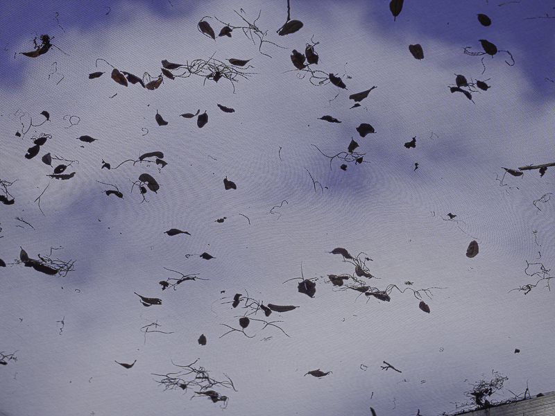
Original digital captureWhat I saw that I liked:Leave suspended on an overhead screen. Cool abstract. What I don't like in the picture:The original, uncropped version is at left. Notice that small edge of the aluminum frame in the very lower right corner. What I learned:My kneejerk reaction to that aluminum frame was to crop it out, hence the version above. Now I'm not sure which version I like better. This is an example of needing the context of the project to make such a decision. I'll need to see where this idea goes once I've had a chance to look at the entire shoot. Only then will I be able to decide about cropping or not. 2nd Chances: What I might try nextAlso, depending on your monitor, can you see the moire patterns caused by the screen texture competing with the pixel patterns on you monitor? |


