Every Picture Is a Compromise
Lessons from the Also-rans
Most photography websites show the photographer's very best work. Wonderful. But that's not the full story of a creative life. If we want to learn, we'd better pay attention to the images that aren't "greatest hits" and see what lessons they have to offer. Every picture is a compromise — the sum of its parts, optical, technical, visual, emotional, and even cosmic – well, maybe not cosmic, but sometimes spiritual. Success on all fronts is rare. It's ok to learn from those that are not our best.
This is a series about my also-rans, some of which I've been able to improve at bit (i.e., "best effort"), none of which I would consider my best. With each there are lessons worth sharing, so I will.
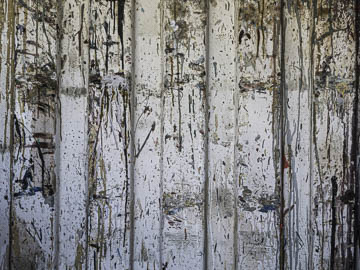
Original digital captureAbstract WeekIf you detest abstracts, please forgive me. I love them! I've made a long-term study of them. Making abstracts is a bit of a mystery, but there are a few ideas that can help. That is the focus of this week's EPIC images. Idea #5:MysteryWhat I don't like in the picture:Actually, the above is not bad. I like aspects of it, but one thing it doesn't have is any sense of mystery. What I learned:Perhaps this is just me, but I always find myself attracted to abstracts that seem shrouded in mystery. For example, the image at left is a puzzle. What are we looking at? I get the feeling that someone knows what this is all about and that its secrets are perfectly decipherable, just not to me! I need to look more deeply, more intently, with my mind fully awake. I try, but it's just beyond my grasp. That sense of mystery is an important characteristic of the best abstracts. If only I could … 2nd Chances: What I might try nextThese kinds of images are often compositionally simple. It's that simplicity that compounds the mystery. We should find the image obvious and easily explainable. We don't, and that makes the mystery deepen — and out attention intensify. |


