Every Picture Is a Compromise
Lessons from the Also-rans
Most photography websites show the photographer's very best work. Wonderful. But that's not the full story of a creative life. If we want to learn, we'd better pay attention to the images that aren't "greatest hits" and see what lessons they have to offer. Every picture is a compromise — the sum of its parts, optical, technical, visual, emotional, and even cosmic – well, maybe not cosmic, but sometimes spiritual. Success on all fronts is rare. It's ok to learn from those that are not our best.
This is a series about my also-rans, some of which I've been able to improve at bit (i.e., "best effort"), none of which I would consider my best. With each there are lessons worth sharing, so I will.
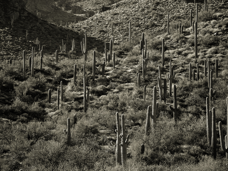
Original digital captureWhat I saw that I liked:Frederick Sommer did this better, but I like the concept a lot, so why not try it myself? What I don't like in the picture:How many times when I'm out photographing have I wished I had a "cherry picker" that would life me about 40 feet in the air? That little patch of sky at the top edge is not good. What I learned:I tried cloning, I tried cropping, I tried Content-Aware fill — none of them worked. Not even close. Then along came Generative Fill and it was perfect, first time. Thanks, Adobe! 2nd Chances: What I might try nextSommer's image was lighter than this. I should try that, too. |


