Every Picture Is a Compromise
Lessons from the Also-rans
Most photography websites show the photographer's very best work. Wonderful. But that's not the full story of a creative life. If we want to learn, we'd better pay attention to the images that aren't "greatest hits" and see what lessons they have to offer. Every picture is a compromise — the sum of its parts, optical, technical, visual, emotional, and even cosmic – well, maybe not cosmic, but sometimes spiritual. Success on all fronts is rare. It's ok to learn from those that are not our best.
This is a series about my also-rans, some of which I've been able to improve at bit (i.e., "best effort"), none of which I would consider my best. With each there are lessons worth sharing, so I will.
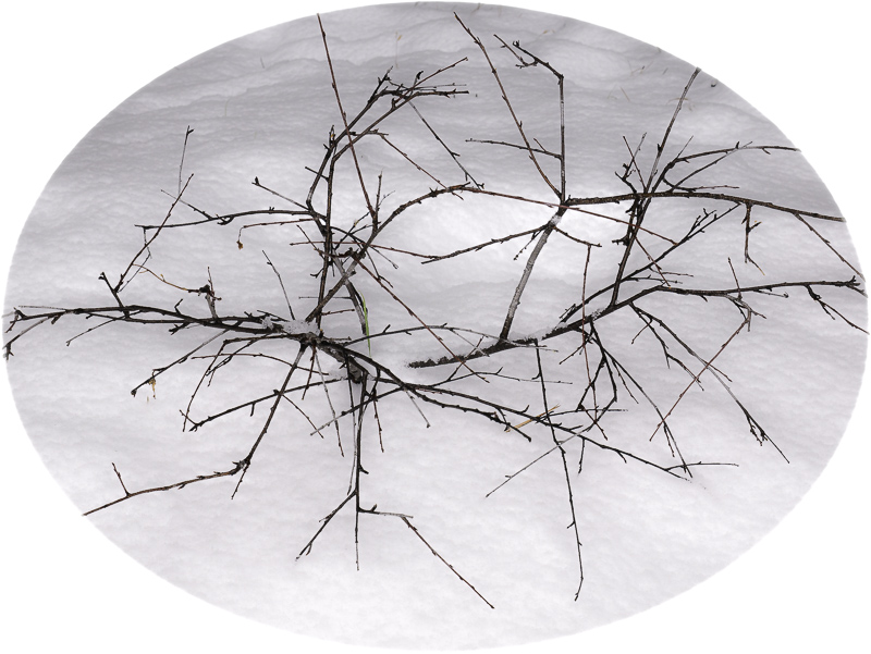
Original digital captureWhat I saw that I liked:Desolate looking winter branches in the snow. What I don't like in the picture:The one above is desolate. It is in the snow. It is isolated. It is blah. What I learned:The one at left is, to my eye, far more interesting. I like the bilateral symmetry. I like that it's less linear than the above. I didn't like the vignetted corners and the tree trunk in the upper left. Making an oval frame resolved it. Who says a picture needs to be rectilinear and have right-angle corners? 2nd Chances: What I might try nextThis could be fun to look for more oval snow shots that I don't know I have! |


