Every Picture Is a Compromise
Lessons from the Also-rans
Most photography websites show the photographer's very best work. Wonderful. But that's not the full story of a creative life. If we want to learn, we'd better pay attention to the images that aren't "greatest hits" and see what lessons they have to offer. Every picture is a compromise — the sum of its parts, optical, technical, visual, emotional, and even cosmic – well, maybe not cosmic, but sometimes spiritual. Success on all fronts is rare. It's ok to learn from those that are not our best.
This is a series about my also-rans, some of which I've been able to improve at bit (i.e., "best effort"), none of which I would consider my best. With each there are lessons worth sharing, so I will.
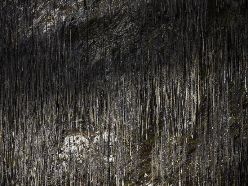
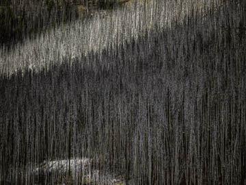
Original digital captureWhat I saw that I liked:Here are attempt to improve the two compromised pictures from yesterday's choice. Improving the composition aboveThat rock in the lower left was lifeless, but adding a touch more light by dodging it makes an improvement. That was the only change from yesterday's original. Improving the light at leftThe image at left started with a better composition, but had dull, overcast light. I added some fake cloud shadows and the image comes to life. The lesson here:My conclusion from this exercise confirms a life-long observation. I would always rather I nailed the composition in the field and adjusted lighting in the studio (Lightroom or Photoshop, in my case). To me the "improved" image at left is way better than the "improved" image above. |


