Every Picture Is a Compromise
Lessons from the Also-rans
Most photography websites show the photographer's very best work. Wonderful. But that's not the full story of a creative life. If we want to learn, we'd better pay attention to the images that aren't "greatest hits" and see what lessons they have to offer. Every picture is a compromise — the sum of its parts, optical, technical, visual, emotional, and even cosmic – well, maybe not cosmic, but sometimes spiritual. Success on all fronts is rare. It's ok to learn from those that are not our best.
This is a series about my also-rans, some of which I've been able to improve at bit (i.e., "best effort"), none of which I would consider my best. With each there are lessons worth sharing, so I will.
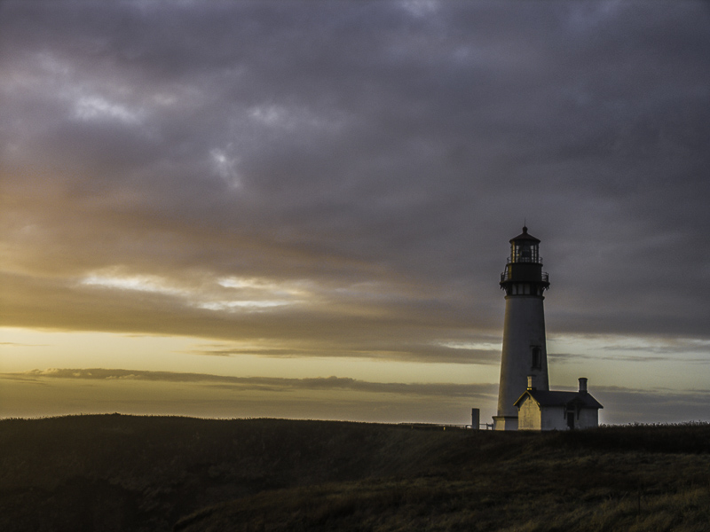
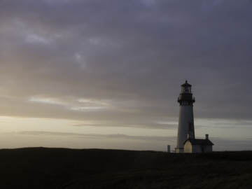
Original digital captureWhat I saw that I liked:Lovely little sunset on the Oregon coast. What I don't like in the picture:The above is a common issue in photography. The colors exist in nature, but they are somewhat muted. What I learned:The fashion in photography today is to crank up the saturation or vibrance to an extreme. To my eye, such images always look exaggerated, unreal, fake. That doesn't mean, however, that we can't punch up the colors a bit. I think it's a matter of the amount of punching up we do. If it looks real, I'm comfortable with it. When it starts to look overdone, that's when I get suspicious. 2nd Chances: What I might try nextLooks to me like I need to refine the sky mask just a bit. At the base of the light house and along the left side, there's a halo that's looking phony. |


