Every Picture Is a Compromise
Lessons from the Also-rans
Most photography websites show the photographer's very best work. Wonderful. But that's not the full story of a creative life. If we want to learn, we'd better pay attention to the images that aren't "greatest hits" and see what lessons they have to offer. Every picture is a compromise — the sum of its parts, optical, technical, visual, emotional, and even cosmic – well, maybe not cosmic, but sometimes spiritual. Success on all fronts is rare. It's ok to learn from those that are not our best.
This is a series about my also-rans, some of which I've been able to improve at bit (i.e., "best effort"), none of which I would consider my best. With each there are lessons worth sharing, so I will.
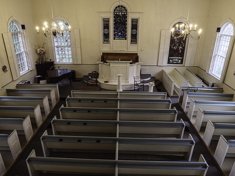
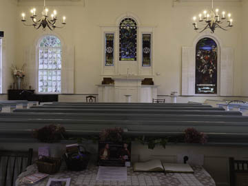
Original digital captureWhat I saw that I liked:An 1803 church in upstate New York. What I don't like in the picture:Decisions, decisions, decisions. Every picture is a compromise. (Where have I heard that before?) What I learned:I like the one above because the hanging lights are visible agains a neutral background. I like the one at left because it eliminates the table of clutter at the bottom of the above. I sure with there was a way to combined the best characteristics of each into a single image. Barring that, decisions, decisions, decisions. 2nd Chances: What I might try nextFrom a strictly emotional point of view, I lean to the one at left. I think. |


