Every Picture Is a Compromise
Lessons from the Also-rans
Most photography websites show the photographer's very best work. Wonderful. But that's not the full story of a creative life. If we want to learn, we'd better pay attention to the images that aren't "greatest hits" and see what lessons they have to offer. Every picture is a compromise — the sum of its parts, optical, technical, visual, emotional, and even cosmic – well, maybe not cosmic, but sometimes spiritual. Success on all fronts is rare. It's ok to learn from those that are not our best.
This is a series about my also-rans, some of which I've been able to improve at bit (i.e., "best effort"), none of which I would consider my best. With each there are lessons worth sharing, so I will.
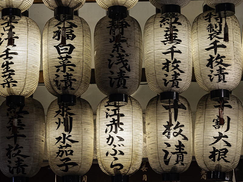
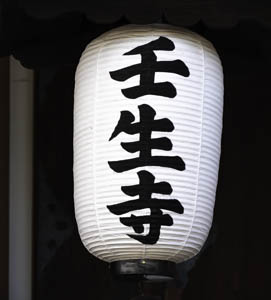
Original digital captureWhat I saw that I liked:Glowing lanterns in Kyoto. What I don't like in the picture:The picture above is of a thing. The picture at left is a place. What I learned:Photographing a single thing always runs the risk of it being perceived as an exploration of a class of objects — lanterns, chairs, blossoms, waterfalls — it doesn't matter what the object is. On the other hand, a group in a single image seems to avoid that. The above image might make sense in a project about Japanese lanterns. The image at left makes perfect sense to be one of a group of images exploring the Nishiki outdoor market — which is where it was photographed. In essence, the one above could be included with the one at left in the same project about lanterns. But if the one at left is included in a project about the Nishiki market, the one above would become repetitious. 2nd Chances: What I might try nextDo I need to brighten the unlit lanterns a bit? |


