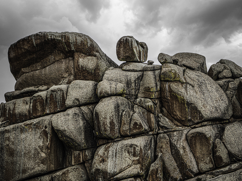
Every Picture Is a Compromise
Lessons from the Also-rans
Most photography websites show the photographer's very best work. Wonderful. But that's not the full story of a creative life. If we want to learn, we'd better pay attention to the images that aren't "greatest hits" and see what lessons they have to offer. Every picture is a compromise — the sum of its parts, optical, technical, visual, emotional, and even cosmic – well, maybe not cosmic, but sometimes spiritual. Success on all fronts is rare. It's ok to learn from those that are not our best.
This is a series about my also-rans, some of which I've been able to improve at bit (i.e., "best effort"), none of which I would consider my best. With each there are lessons worth sharing, so I will.
Original digital captureWhat I saw that I liked:Last one from Vedauwoo, Wyoming What I don't like in the picture:"Yes, but," I can hear you saying, "isn't this the same problem with scale that you discussed a few days ago?" What I learned:Yes, and no. This image lacks scale, but used in a project with others that do, this one can be successful be association. It depends on where this one appears in the sequence of images. As long as it is near the end and the previous images have set the scale, I can get away with this one in the context of the project. This is one of the advantages of multi-image projects compared to the singe image that must stand on its own. 2nd Chances: What I might try nextI might want to pull up those darker shadows a bit. |


