Every Picture Is a Compromise
Lessons from the Also-rans
Most photography websites show the photographer's very best work. Wonderful. But that's not the full story of a creative life. If we want to learn, we'd better pay attention to the images that aren't "greatest hits" and see what lessons they have to offer. Every picture is a compromise — the sum of its parts, optical, technical, visual, emotional, and even cosmic – well, maybe not cosmic, but sometimes spiritual. Success on all fronts is rare. It's ok to learn from those that are not our best.
This is a series about my also-rans, some of which I've been able to improve at bit (i.e., "best effort"), none of which I would consider my best. With each there are lessons worth sharing, so I will.
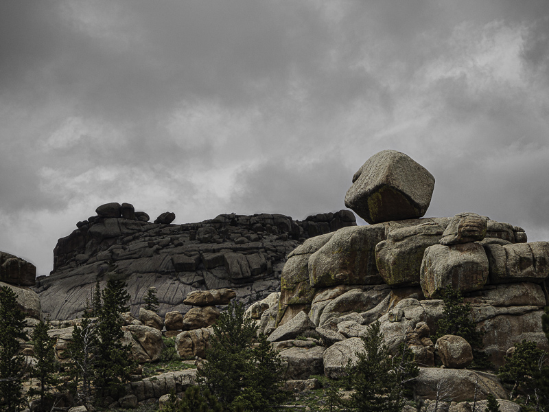
Processed digital captureWhat I saw that I liked:In my mind's eye, I saw this as a panorama as in the processed image above. Fun cubic boulder of granite. What I don't like in the picture:Once I had completed the processing into a panorama, I realized that by removing the trees I had lost all sense of scale. Nice panorama photo, but divorced from scale it loses a lot of what makes that boulder impressive. What I learned:The trees have got to stay. I'm okay with that. The light and the dramatic clouds help keep the image interesting. I like the cropped version above, but find it less impressive when I don't know the size of that curious boulder. 2nd Chances: What I might try nextWhat if I pasted in a couple of crows? Would that be cheating? (Be sure to check out tomorrow's image.) |


