Every Picture Is a Compromise
Lessons from the Also-rans
Most photography websites show the photographer's very best work. Wonderful. But that's not the full story of a creative life. If we want to learn, we'd better pay attention to the images that aren't "greatest hits" and see what lessons they have to offer. Every picture is a compromise — the sum of its parts, optical, technical, visual, emotional, and even cosmic – well, maybe not cosmic, but sometimes spiritual. Success on all fronts is rare. It's ok to learn from those that are not our best.
This is a series about my also-rans, some of which I've been able to improve at bit (i.e., "best effort"), none of which I would consider my best. With each there are lessons worth sharing, so I will.
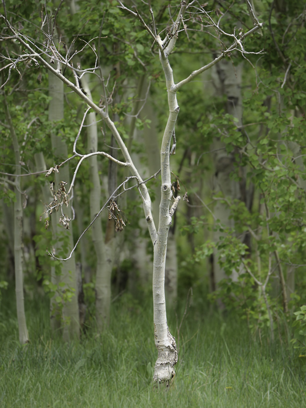
Original digital captureWhat I saw that I liked:Ethereal tree. I visualized a soft focus background, but wanted more than I could achieve with shallow depth of field. What I don't like in the picture:As you can see in the above, the background trees are soft, but I wanted more. What I learned:I thought this might be a good image to text Lightroom's "select subject" mask. It did a pretty good job, but I had to manually finesse the mask a bit. A little minus clarity and the backgound went just soft enough. Whew! 2nd Chances: What I might try nextColor balance? I could warm it up a bit. |


